Blogaversary 7: by the numbers

Sometimes I think I should title this after the first real post on the blog: Quarterly Update (XXVIII). I was so optimistic back then, June 11, 2001, that I never promised anything more than occasional updates. Fortunately, I kept writing, and somehow the habit stuck, through seven years.

Right now the seven years of this blog represent the second longest time interval I’ve spent doing one thing in my adult life (the first would be, of course, being married to my wonderful wife). The blog has been through three different hosts and two different platforms, starting with Manila on UserLand’s EditThisPage.com, moving to my own Manila site and domain name at Weblogger, and then just a month or so ago migrating to WordPress. Along the way, there have been four major redesigns: a Bryan Bell theme, two scratch-built CSS themes, and the current tweaked theme from Excel.
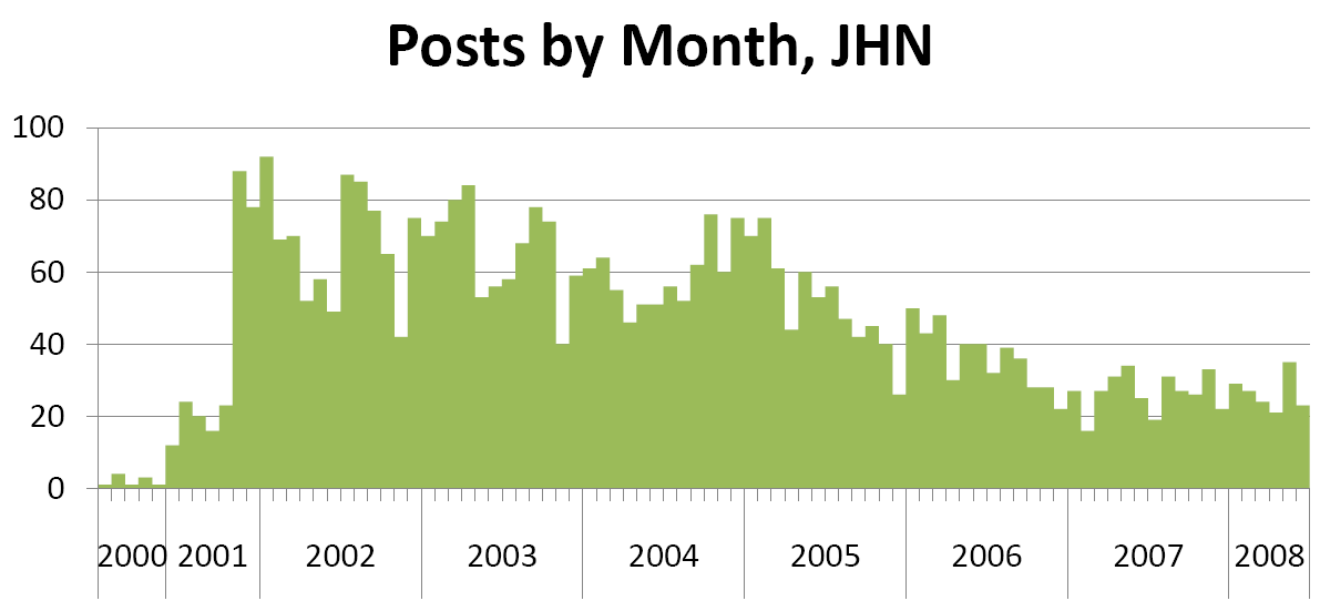
Posts by Month to Jarrett House North
According to WordPress’s stats, the result has been around 4,100 posts, give or take, along with a handful of longer pieces and a bunch of images. The quantity per month, and per year, has fallen off since 2002, but hopefully the quality is increasing (see the chart below for details).

A few fine points on the chart:

  • As always, my blogaversary date is fungible. I began regular posting in June 2001, but there were a small handful of posts in 2000 as well. If I wanted to, I could say that the blog is older than the Tin Man, who began in January 2001, but that wouldn’t be fair.
  • The main sea change in my posting rate happened at the end of 2005, when I took on the Boycott Sony blog in addition to my posting here. There’s not likely to be an event like that to make me slow down here again.
  • My posting frequency was falling off a little this year, until I migrated to WordPress. Now there’s an uptick that I think will continue to go.
  • There’s an inverse relationship between periods in which I was happy with my work and posting frequency. I’m really glad to say that, since 2005, I haven’t been going crazy with the posting.

Of course, the post counts are easy to skew. I used to post two and three sentence posts, now I save that for the linkblog.

So why do I keep posting, anyway? I’ve always liked sharing things I found with people, and apparently people like to read it. Plus there’s my other, time-delayed audience: Google. It’s really rewarding to see what people have found useful in the blog, a long time after I wrote it. Now that the blog has comments again, I’m looking forward to having a more interactive relationship with you, my readers.

My hope is that I will keep doing this for the next seven years, and beyond, and that you’ll stay with me for the ride.

CSS fixin’: toward a vertical grid

It should be theoretically possible with CSS to design a page where the type falls on a vertical grid. In reality, you rarely see this happen because multi-column sites make matching the grid values across the columns difficult, and browsers, particularly IE, have awkward ways of inserting inconsistent space around some block elements.

But the basic theory is simple enough. Decide the base unit of height of the page, and go through your stylesheet, making sure that everything there is a multiple of the base unit of height. Your tools are line-height, padding-top and padding-bottom. For example, if your base measurement is 20 pixels between lines of type, and you want space between your paragraphs, you might define a style like p { line-height: 20px; padding-bottom: 20px;} or even p { line-height: 20px; padding: 10px 0;} (where the latter splits the padding above and below the paragraph).

Getting it to work right can be a real bitch, though. What if you have a heading that you want to set larger than 20 points? The naïve approach (which I just implemented) might be to implement a rule like this: h3 { font-size: 24px; line-height: 28px; padding: 8px 0 4px;} where the 28 pixels of line height are padded with a total of 12 pixels to make up 40, or two lines. But this only works if all your h3s are less than one line in height; a heading spanning two lines will take up 66 pixels, or a little more than three lines, messing up the grid. The recipe for success is to avoid setting multi-line headings too closely–or perhaps to use smaller font-sizes for headings.

Here, as in all things related to web typography, a valuable resource is The Elements of Typographic Style Applied to the Web, the brilliant adaptation of Robert Bringhurst’s essential typography rulebook to CSS+HTML+ (occasionally) JavaScript. In this case, the sections on vertical motion (Choose a basic leading that suits the typeface, text and measure and Add and delete vertical space in measured intervals) are invaluable, and I’m going through this theme’s stylesheet and working on applying the principles now. So if things look odd, don’t worry, it’s not just you.

I should also point to 8 fonts you probably don’t use in CSS, but should as the inspiration to change my sidebar headers to Gill Sans (though I might pick a different sans in a day or two), and 10 Examples of Beautiful CSS Typography and How They Did It for the specific inspiration to use small, capitalized, letterspaced sans serif for the headings. Both are quite well written posts from the blog at 3.7 Designs.

Ongoing minor site maintenance

I’m putting enough energy into this particular theme that I think I might keep it around a while. Today I addressed a problem with my daily link posts, which come from del.icio.us with some embedded markup. The formatting of that markup was causing some bogus line breaks (on Firefox, the list bullet displayed on a line by itself), which I eliminated with some simple CSS rules. I’m probably not done playing with the formatting of the link posts, but I’ve fixed the immediate problem for now.

I’ve also created some linkage to parts of the site that used to be exposed in my main navigation, and added a few more top navigation links. Enjoy…

Greatest hits, revisited: Whither SOAP?

I’ve been doing a bit of clean up on some of the early days of my site. Back then, I used Manila’s “story” feature (akin to WordPress pages), and a bit of code that allowed you to edit the front page of the site every day, flipping the old version back into the archives automatically when the new version was published. Over time I transitioned to using the “news items” feature of Manila extensively (what WordPress and just about every other blogging platform calls “posts”). When we did the WordPress conversion, some of my stories were translated into posts and others into pages. So I’ve been going through and changing a few over to posts and backdating them so that you can navigate the site with the calendar. The work isn’t done, but you can go back and read Esta’s protoblog now, and the Mothman’s trail report (or you will be able to as soon as I fix a bug with the path names).

Along the way I turned up some of my early “greatest hits,” those things I wrote that got a lot of people reading the blog and pointing to me, and that encouraged me to keep going. The earliest greatest hit was a piece unfortunately titled Apple: How to bury an important announcement, in which I critiqued Steve Jobs’ July 2001 MacWorld keynote address for talking about new iMacs rather than talking about the upcoming Mac OS X 10.1’s support for the low level protocols (SOAP and XML-RPC) that enable web services.

At the time I said that the unheralded announcement was significant because web services represented a significant evolution of the Internet, as significant as HTML; I said “XML-RPC describes how to allow different computer programs to talk to each other across the Internet.” I said that Microsoft with .NET (and Hailstorm! Remember Hailstorm?) was making a bet that web services were where applications were going, and that Steve was coming on board with that shared vision.

Was I right? From almost seven years later, I’d say it’s a mixed bag. The vision for web services was kind of originally the “cloud computing” vision–you’d have a rich client on your desktop that hooked up to complex software on the Internet using web services. What’s interesting is that while that has certainly happened — look at MarsEdit or other desktop blog editors, or the rich client that I helped ship while at iET Solutions — the real value proposition for web services has been in two areas: integration and mashups. Kind of two sides of the same coin but with very different audiences.

Integration is the business face of getting two computer systems to talk to each other. Think hooking SalesForce into your financial system, or into your ticketing system. Then imagine doing it if you had to consume a SalesForce COM object. Not gonna happen, right? The use of web service APIs to allow hooking systems like SalesForce together with other corporate systems has weakened the case that you used to hear, that your software must be sufficient unto itself because the cost of building and maintaining integrations was so high. It’s also, in an interesting way, increased the adoption of SOA and applications that live off premise. I don’t think you’d see such a high adoption of SalesForce if it couldn’t integrate quickly and easily.

Mashups is the name you use when you’re trying to be cute about doing integration with “consumer” data, or the stuff that you and I use every day. The interesting thing about mashups is that they enable easy connections between web applications–cloud-to-cloud connections, in the earlier analogies. So del.icio.us can automatically post things to my blog; everyone and his brother can get images from Flickr; and your latest Ajaxy website can go from start to finish without requiring you to do a single HTTP refresh.

Of course, mashups vs integrations is an artificial distinction. There’s no technical difference (aside from a bunch of WS* crap in the headers) between the SOAP spoken by WordPress and by SalesForce. It’s just angle brackets. People spend a lot of time positioning mashups as “situational applications” to be done by the unwashed masses, but I think the biggest difference between mashups and “integrations” is intended audience and permanence, nothing more.

With that in mind, we should be at the beginning of what can be done with web services. And that SOAP and XML-RPC layer in the Mac OS should be getting a real workout.

Excel theme fix list

I’m writing this working list so that I can keep a record of what I did to the Excel theme to get it the way I like it, as well as for anyone else who’s interested in learning how to hack up WordPress themes.

Issues:

  • The amount of vertical space consumed by the header region (seems to be a common trend among the themes I’ve tried so far)
  • Need to tweak styles — tags and recent comments run into each other, headings in the sidebar are too prominent, need some custom style work for the Delicious widget
  • The dark borders around images and the big blocky links make the top of the page feel too heavy
  • Category and single post pages missing blog title

Fixes to date:

Tags: I replaced the function call for tags that was in the theme to specify the following: the_tags('<ul class="pmeta-tags"><li>Tags: ',',</li> <li>','</li></ul>');. This basically made the tag a true unordered list with a new class, pmeta-tags, and inserted a comma and a space after each item in the list except the last one. Then I edited the stylesheet to define ul.pmeta-tags as display:inline. So the tags now displays as a comma separated list. I tried a different, very handy, css-only approach (example) first, but the browser didn’t pick up the specified commas or spaces as cues to break the line, and so the content disappeared off the right hand side of the box.

Recent comments: I used the CSS-only example cited above to style the comments and provide a semicolon as a separator between comments. Alas, IE doesn’t understand this approach so I’ll have to do something else here.

Blog title on other pages: I edited the header.php file to include the blog title in parens after the title of the object (post, category, etc.)

Today’s theme: Excel

Snapshot of JHN with the Excel theme.I switched on Monday to a new theme, Excel, that addresses a few of the issues I had with Cutline. The color balance is much better than with the version of Cutline I was using (which I must say, in all fairness, was a much older version of the theme). I also like the layout, which is a two column layout but which floats the post “trivia” (publish date, tags, categories, etc.) in a separate mini column, leaving just post title and text in the main column.

Things I don’t like:

  • The amount of vertical space consumed by the header region (seems to be a common trend among the themes I’ve tried so far)
  • Need to tweak styles — tags and recent comments run into each other, headings in the sidebar are too prominent, need some custom style work for the Delicious widget
  • The dark borders around images and the big blocky links make the top of the page feel too heavy

But it feels closer than Cutline did.

About today’s theme: Cutline

Cutline 3 Column WordPress ThemeI swear I’ll stop writing about the site soon, but right now the visual aspects are kind of front and center in my mind. Today’s theme is called Cutline, and it’s by Chris Pearson. It’s a very popular theme, currently number one at the WordPress themes site.

Things I like about it:

  1. Appearance: crisp, graphically well laid out, doesn’t use the Microsoft sans serifs (though I’m not crazy about Arial/Helvetica as they ship, and will probably make some tweaks here).
  2. Post layout: brings the interaction element right up top.
  3. Easy to manage.
  4. The headline image has interesting placement, the author has provided an easy way to randomize the headers, and the non-obvious image dimensions have made me think about how to pull details out of larger photos.

Things I don’t like:

  1. The typographic color is all off. The posts disappear in the middle of the page because the sidebars are so dark. Partly this is because of…
  2. The heavy use of horizontal rules as separators. The dark lines pull my eyes all over the place. And the bold Helvetica/Arial for the headline type in the sidebar is overkill.
  3. The title region plus the header image pushes the site pretty far down the page.
  4. Not liquid layout. I appreciate the fact that I don’t have to cram everything into one sidebar, but it makes the page harder to work from an information perspective, and it limits the resizing I can do. Plus the sidebars are sized in pixels, so that limits the amount of text resizing I can do.

I can fix #1 and 2, and have some ideas about #3, but #4 is something I’d rather not try to fix myself. I’ll have to see how other themes handle this issue.

Anyone have strong thoughts about this theme?

Housecleaning

Still working on getting the new site up and running. I reinstituted the blogroll today, starting from scratch (it’s amazing how many links, old friends’ blogs particularly, have lapsed). If you’re reading this in RSS, you’ll have to go to the site to check it out.

I also removed the del.icio.us widget from my sidebar, because (drumroll) I was able to get their autoposting service to work. So that post with all the links? That’s my bookmarks from yesterday. Right now it’s set to fire daily between 6 and 7 pm, so you’re pretty much guaranteed that you’ll get a daily update from me, though it may not be my wittiest, wisest prose.

One downer: There doesn’t seem to be a way to format the posts. So you’re stuck with my unfiltered output and an ugly format. Maybe once I finish rebuilding the site theme the autoposts will start to look better.

Welcome back

Things are still a little nutty here, but welcome to the newly rebuilt Jarrett House North blog. As you can see, we’re now rockin’ the WordPress, thanks to Erin Clerico, my good host at Weblogger. I’m also rockin’ a standard WordPress theme, but never fear, the house will be back soon.

There are a few things broken. There are broken images, which I’m fixing one at a time. I need to reintegrate some non-blog content, such as my genealogy pages, and of course I have to point all the old blog addresses to this one. But it feels good to be back online.

Trying to use Disqus

I read with some interest that Dave Winer is experimenting with the comment service from Disqus on Scripting News. I turned comments completely off on my site one year ago today and really miss the interactivity. So I signed up for Disqus to see what I could get.

Unfortunately, I can’t figure out how to make Disqus work with Manila. I use a hosted Manila site, so I can’t resort to back-end code to make the integration work, and there are two critical pieces that are missing for me to be able to implement Disqus:

  1. A unique page for each post. This is obviously not Disqus’s fault, but the version of Manila that I use has one page per day, not per post. So it’s not clear where the comment form should go.
  2. A way to modify the permalink URL. The generic Disqus instructions say to publish a version of the permalink URL followed by #disqus_thread. Unfortunately, I don’t appear to have access to a Manila macro that will do this—I get the permalink as a fully formed link.

So it looks like, unless the Disqus people come up with something, I have yet another reason to accelerate my move to another blog platform.

Except…hmmm, now I have an idea about how I might pull it off. Let’s see if I can make it work.

Photo sharing

I was contacted today by Schmap, an online travel guide, to use one of my photos of downtown Portland (the sand castle contest photo) in their guide. They found me on Flickr and actually had the courtesy to ask about the photo before they reused it—it’s a Creative Commons-licensed photo. Rather novel, really—I’ve only been asked about one other of my photos, though I have no way to know if any of the others have been reused.

Blogaversary VI

Six years ago today, I sat at a computer in the Seattle suburbs and updated this site, thinking I would manage to update it again only under extreme duress; hence the optimistic title Quarterly Update (I). A funny thing happened shortly thereafter, and I got the blogging bug. And I haven’t been quite the same since.

Oh, this blog and I have had our ups and downs: three redesigns in the first three years; periods of six posts a day and periods of a post every six days; posts about my family, technology, music, and beer; and our dogs and our house. And occasionally I might have written something worth linking to.

I’ve been through periods where I watched my hit counts and my referrers several times a day. Where I despaired if my month over month readership fell. Where I treasured reciprocal links like signs of friendship.

These days? Well, last year I was a little bummed over the fact that my frequency of posting was falling off. In retrospect that was an inevitable fallout of the Sony Boycott blog period, when I was updating two blogs several times a day. But I also think it was a year ago that I first decided that the important thing wasn’t post frequency or readership, blogrolls or PageRank. It was the writing.

So from here on out I think I’ll just keep writing. One post at a time.

After all, this blog isn’t a sprint. It isn’t even a marathon. (For one thing, no one’s kissing the writer in Wellesley.) It’s more like breathing.