Excel theme fix list

I’m writing this working list so that I can keep a record of what I did to the Excel theme to get it the way I like it, as well as for anyone else who’s interested in learning how to hack up WordPress themes.

Issues:

  • The amount of vertical space consumed by the header region (seems to be a common trend among the themes I’ve tried so far)
  • Need to tweak styles — tags and recent comments run into each other, headings in the sidebar are too prominent, need some custom style work for the Delicious widget
  • The dark borders around images and the big blocky links make the top of the page feel too heavy
  • Category and single post pages missing blog title

Fixes to date:

Tags: I replaced the function call for tags that was in the theme to specify the following: the_tags('<ul class="pmeta-tags"><li>Tags: ',',</li> <li>','</li></ul>');. This basically made the tag a true unordered list with a new class, pmeta-tags, and inserted a comma and a space after each item in the list except the last one. Then I edited the stylesheet to define ul.pmeta-tags as display:inline. So the tags now displays as a comma separated list. I tried a different, very handy, css-only approach (example) first, but the browser didn’t pick up the specified commas or spaces as cues to break the line, and so the content disappeared off the right hand side of the box.

Recent comments: I used the CSS-only example cited above to style the comments and provide a semicolon as a separator between comments. Alas, IE doesn’t understand this approach so I’ll have to do something else here.

Blog title on other pages: I edited the header.php file to include the blog title in parens after the title of the object (post, category, etc.)

Today’s theme: Excel

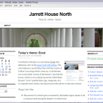
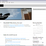
Snapshot of JHN with the Excel theme.I switched on Monday to a new theme, Excel, that addresses a few of the issues I had with Cutline. The color balance is much better than with the version of Cutline I was using (which I must say, in all fairness, was a much older version of the theme). I also like the layout, which is a two column layout but which floats the post “trivia” (publish date, tags, categories, etc.) in a separate mini column, leaving just post title and text in the main column.

Things I don’t like:

  • The amount of vertical space consumed by the header region (seems to be a common trend among the themes I’ve tried so far)
  • Need to tweak styles — tags and recent comments run into each other, headings in the sidebar are too prominent, need some custom style work for the Delicious widget
  • The dark borders around images and the big blocky links make the top of the page feel too heavy

But it feels closer than Cutline did.

About today’s theme: Cutline

Cutline 3 Column WordPress ThemeI swear I’ll stop writing about the site soon, but right now the visual aspects are kind of front and center in my mind. Today’s theme is called Cutline, and it’s by Chris Pearson. It’s a very popular theme, currently number one at the WordPress themes site.

Things I like about it:

  1. Appearance: crisp, graphically well laid out, doesn’t use the Microsoft sans serifs (though I’m not crazy about Arial/Helvetica as they ship, and will probably make some tweaks here).
  2. Post layout: brings the interaction element right up top.
  3. Easy to manage.
  4. The headline image has interesting placement, the author has provided an easy way to randomize the headers, and the non-obvious image dimensions have made me think about how to pull details out of larger photos.

Things I don’t like:

  1. The typographic color is all off. The posts disappear in the middle of the page because the sidebars are so dark. Partly this is because of…
  2. The heavy use of horizontal rules as separators. The dark lines pull my eyes all over the place. And the bold Helvetica/Arial for the headline type in the sidebar is overkill.
  3. The title region plus the header image pushes the site pretty far down the page.
  4. Not liquid layout. I appreciate the fact that I don’t have to cram everything into one sidebar, but it makes the page harder to work from an information perspective, and it limits the resizing I can do. Plus the sidebars are sized in pixels, so that limits the amount of text resizing I can do.

I can fix #1 and 2, and have some ideas about #3, but #4 is something I’d rather not try to fix myself. I’ll have to see how other themes handle this issue.

Anyone have strong thoughts about this theme?