Apple Music follow up – iPhone tips

Following last week’s post about plunging into Apple Music, I have to temper my initial mild exuberance with some reality checks about things that didn’t work so well, and how I got past them. The issues are almost all related to my iPhone, but there was also some playlist weirdness that I had to work through.

Learning number 1: You can’t copy music to your iPhone via sync when you choose to sync your whole library via iCloud. This seems kind of obvious when you write it out that way, but this was a major problem because lots of playlists were just not showing up for me when I flipped my phone to do a library sync with iCloud. These included my smart playlists that I listen to almost all the time (and which I’ll have to write up sometime soon).

Learning number 2: The new Finder-based iPhone sync doesn’t pick up newly created playlists until the Mac Music app is quit. I thought I was losing my mind, because in an effort to fix the missing playlists problem, I created new copies of the playlists with the same rules but different names. And none of them were showing up in the Finder iPhone Sync window. After I quit Music, the new playlists appeared, as did other changes that I made.

This reminds me of something I remembered about third party apps that read the iTunes library file a long time ago — certain changes had to wait for the app to quit because it would keep the file locked until then. Or maybe it was that there was an XML shadow copy of the library that was only updated on Quit? Anyway, I now could at least see the playlist.

Learning number 3: Sometimes you just have to burn it to the ground and start over. Even after I saw the playlist in the Finder, clicked the checkbox, and synced my iPhone, I still didn’t see the playlist when I opened the Music app in the iPhone. This morning I just decided to hell with it, turned off all music syncing, then turned it back on and copied the playlist over. Which worked.

I’m kind of glad I did this, because it gave me some evidence for some benefits in syncing in Catalina. I copied over about half my playlists — tens of GB of data — in less than 30 minutes. This gives me confidence that the underlying synchronization should be at least as fast, if not faster, than the iTunes based sync in Mojave and before.

Other observations:

Syncing your library sometimes duplicates playlists. I’m not sure where the issue was here, but I had something like two or three copies of some of my common playlists after turning on library syncing on my iPhone, iPad and work computer. I deleted the extras, crossing my fingers that I wasn’t causing any problems, but am not sure that this didn’t contribute to the issues I saw on my iPhone.

The way playlists show up in the Finder is a mess. The list of playlists is a garbage fire. Possibly related to the observation above, I saw not only playlists but folders duplicated in the Finder list—and the duplicate folders sometimes had different contents. Not only that, but the playlists in a folder weren’t in alphabetical order. This means that finding a playlist to include in a sync is a total mess.

Now that I’ve gotten through all the above, I am starting to wonder if all my initial problems were caused by a goofed-up iPhone Music library, and if turning on library syncing again might result in a fully working setup. I’m inclined to try the experiment, since syncing did solve one persistent problem for me by making regular-resolution copies of songs that were too high-resolution for the iPhone to handle available for mobile play. But I think I’ll wait until after the weekend.

Waiting for changes to be applied

So far iOS 5 has been just fine on my iPhone 3GS (yes, still), but for one important exception: I don’t think the phone has ever completed a sync without my having to eject it.

The symptom is one of those things that gives long-term iTunes users pause: text in the iTunes status window that appears at the end of the sync, saying, “Waiting for items to copy,” or “Waiting for changes to be applied.” And stays there, pretty much indefinitely. Turns out it’s a common problem, with no consistent solution. I have tried leaving the phone syncing all night long (both wired and wireless), even tried turning off syncing of all content. Nothing.

So today I tried the ultimate: restore to factory settings, then restore from backup. And, as of right now, things are… “waiting for items to copy,” while syncing podcasts.

Sigh. Wonder how long I have until we can buy the 4S?

There is one note of wonderment though: as I was plowing through the console looking for clues as to what was going on, I found this:

Nov 10 07:11:44 iTunesHelper[248]: AMDeviceConnect (thread 0x7fff7c774960): This is not the droid you're looking for (is actually com.apple.mobile.restored). Move along, move along.

Heh.

UPDATE: Aaaand just as soon as I pushed Send to Blog, I found the answer: voice memos. Specifically, deleting all voice memos on the phone was sufficient to fix the problem and allow the sync to complete. Now, mind, this was after a restore to factory settings and restore from backup, so I don’t know if those steps were necessary, but it worked.

“Vir-ir-gin-i-a”: from the UVA iPhone app to Bob Dylan

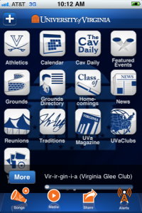
I was pleased to download and check out the University of Virginia’s new iPhone app. “One stop” doesn’t begin to cover the scope of this app — Grounds directory, news, alumni clubs, reunions, alumni magazine, the Cavalier Daily, sports scores (and notifications)…

…and music. I was even more pleased to find the Virginia Glee Club‘s recording of “Vir-ir-gin-i-a” on the app’s list (along with marching band renditions of “The Good Old Song” and other Virginia tunes. While “Vir-ir-gin-i-a” seems an odd tune to represent Club–the recording from which the song was taken, Songs of Virginia, has many more familiar UVA related songs including the superb “Virginia, Hail, All Hail“–it’s actually an interesting tie to the past of both the University and the Glee Club.

“Vir-ir-gin-i-a” has many connections to the Glee Club. Featuring an arrangement by long-time Club conductor Donald Loach based on a tune by Handel, the text is by UVa professor Arthur Kyle Davis, Jr. (1897-1972). Davis himself sang in the Glee Club shortly after the group’s reformation by Alfred Lawrence Hall-Quest, serving as secretary during the group’s 1916-1917 season (during which Club performed the blackface musical Oh, Julius!,” a minstrel-show story of life in ancient Rome). Davis went on to serve in the Army during World War I; went to Oxford on a Rhodes scholarship; and returned to the University as a professor in the English department in 1923.

And here’s where it gets interesting. Davis went on to his greatest fame as a folklorist, collecting three volumes of traditional ballad and folk songs through field research and becoming the archivist for the Virginia Folklore Society. The main thrust of his research was in showing that the English and Scottish ballads listed and enumerated by Harvard folklorist Francis J. Child (the “Child Ballads”) were alive and well on American soil for hundreds of years before their collection and numbering by Child.

While influencing numerous Virginia faculty, including Paul Gaston, his most unlikely influence was on folk singer and song collector Paul Clayton, a student of his in the 1950s, whose song “Who’ll Buy You Ribbons (When I’m Gone)” was “re-gifted” by Bob Dylan for “Don’t Think Twice, It’s Alright.” Of course “Who’ll Buy You Ribbons” was itself “re-gifted” from an Appalachian song called “Who’s Gonna Buy Your Chickens” which Clayton learned from Mary Bird McAllister, a song that was collected by Clayton while he was Davis’s student.

And “Vir-ir-gin-i-a”? Davis knocked it out in his spare time, apparently, in honor of the University’s sesquicentennial and premiered it himself at a meeting of the Jefferson Society. Loach arranged it for men’s voices for the 1972 Glee Club LP A Shadow’s on the Sundial, which financed the group’s first European tour, and it’s been in Club’s repertoire on and off since.

So while there are better known, and arguably better, pieces of Virginiana that could feature on future UVA app playlists, there are few that have so many interesting touchpoints to Glee Club, Virginia, and even pop music history.

What’s the difference between iPhone and Android?

I work with iPhone users and Android users. I see no end of technology demos from both. It’s clear both phones are wonderful devices capable of doing amazing things.

So why do iPhone reviews make it sound like the device can walk on water, while a lot of Android reviews sound like this?

Unfortunately, these groundbreaking features come with enough fine print to give the White Pages an inferiority complex.

First, the screen… you can’t have a big screen on a small phone. The Evo is nice and thin, but it’s also tall and wide. It is not for the small of hand. People might mistake it for an iPad Nano.

The Wi-Fi hot spot business is slick…. this feature eats through a full battery charge in as little as one hour. (More on the Evo’s amazing disappearing battery in a moment.) And beware: the hot spot feature costs an extra $30 a month.

O.K., so what about Flash? … The Evo runs something called Flash Lite, which is marketing-ese for, “Sometimes works and sometimes doesn’t.” It plays videos on some sites that the iPhone can’t — on Engadget, for example, plus all the blinking ads (a mixed blessing). But it still can’t play the Flash videos on CNN.com or, sadly, TV shows on Hulu.com.

All right, what about video calling? Surely this is the killer app. Imagine: your friends and family can not just hear you, as with normal phones, but see you as well (assuming they also bought Sprint Evos, of course).

Well, let’s hope they’re NASA engineers, because this feature is head-bangingly unstable….

And this?

There’s a sense, not just from reviewers, but from fans of the device, that what Android really needs is just killer hardware.Which is just absolute horse shit.

Android is an asshole of an operating system.

… I discovered software I could find no way to uninstall; programs which hung around after I was done with them with no way to quit I could find; interfaces which featured tiny poorly placed buttons near impossible to click without concentration; inconsistent search functionality where the “it’s right there on the phone” search button worked or didn’t work or did work but not as you’d think it’d work. I nearly started a tumblr called “Jesus Christ I Hate This Fucking Phone” just to document all the utterly asinine behaviors my iPhone-killer-anyday-now exhibited.

There’s an argument to be made (so of course, I’ll make it) that the Android experience failures described above are not technology failures. Android’s technology and operating system are impressive. But the whole package doesn’t seem to add up very well. Compare to iPhone, where (App Store policies to the contrary, and it’s a big contrary) the whole experience is consistent and wonderful and hangs together.

The whole experience part, I think, is the key. One suspects that on most Android phones that there’s no one–not Google, not the handset maker, not the carrier–who is taking responsibility for the whole end user experience. And it shows. David Pogue’s review describes a phone whose makers, if they made tradeoffs between features and constraints at all, traded off things that most people consider essential (size, battery, stability and consistency of experience) in favor of flashy features. The result is a phone that demos well but handles poorly. And Jack Shedd’s experience with the phone describes something that’s inconsistent and hard to use when you consider it as a whole device.

Does any of this — feature prioritization, product packaging design, user experience — sound familiar?

What’s the difference between iPhone and Android? Product management is the difference.

I’m willing to bet that the product managers on the Android phones had organizational limitations on how much of the user experience that they controlled, or edicts about must-have features in which the end user experience carried little weight, and that they could do nothing about those limitations. But show me a product manager who allows organizational pressure to impair user experience, and I’ll show you a product manager who has prioritized organizational harmony against sales success.

Reunion on the iPhone: Genealogy on the go

reunionI got an email from someone the other day asking about one of my ancestors (Andrew Hershey, 1702-1792). I get this sort of email all the time, since my family tree is online, and normally I’d have looked up the answer to the questions and emailed back. The problem was, I was on my iPhone and didn’t have access to my detailed genealogy research. I found myself thinking, I wonder if there’s a good genealogy app for the iPhone. Maybe something that will read my GEDCOM export and display it nicely. It would be really great if Reunion were on my phone, though.
So I hit the app store, and the first app in the search results for genealogy was … Reunion! Leister Pro has done an iPhone client that allows you to bring your genealogy data with you, and sync it back to your Mac when you’re done… sort of.

I have about 4000 records in my family data, and opening and browsing it is quick and painless. The UI is splendid, taking all the best parts of the Reunion “family card” display and porting them painlessly to the iPhone. Images are supported, and the experience is almost like sitting in front of my Mac.

There was one glitch I encountered–somehow my sources data didn’t seem to move from my Mac, something I’ll need to investigate further–and two missing features. On the iPhone it would seem natural to provide the ability to add a photo from the phone’s photo list or from the built-in camera to an entry; neither is currently supported. And the app relies on a Bonjour based syncing strategy — turn on your phone, click a button on your Mac, and the syncing happens over your WiFi network — that happens separately from the phone’s main sync loop. Based on your opinion of iPhone syncing, this may be a good or bad thing, but surely there are other sync methods available that wouldn’t require a separate action.

Right now these are quibbles–I’m generally very pleased with the app, and thrilled Ididn’t have to find a new genealogy app just for the iPhone.

Macworld Keynote 2009

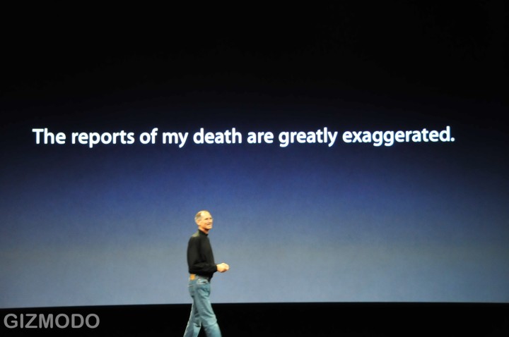
It’s not going to be a Stevenote (and on that note, best wishes to Steve as he gets his hormones back in balance and gets some protein in his system). But I’ll be watching all the more closely, to see how Phil Schiller takes on the challenge of igniting excitement in the Mac faithful. Like many product managers, I have picked up a few tips about presenting product over the years from Steve, and Phil will have his own style and his own techniques which I can hopefully also snarf.

Product predictions? I like John Gruber’s, and can lend credence to the iLife prediction because I finally got the most recent version as a Christmas present. Pretty sure there won’t be any new iPhone products announced today though (outside of the iPhone version of Delicious Library).

I’m pretty sure that Apple won’t be announcing the Mac Wheel today, though (hat tip to Chris Eng for the pointer):

Apple Introduces Revolutionary New Laptop With No Keyboard

Keep your hands and feet inside the car at all times…

…because something tells me this race is going to be a rollercoaster for the next few weeks.

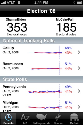
Screenshot below from the excellent Election ’08 iPhone App, from Pollster.com and Slate. For a more nuanced view, look to the fine folks at Electoral-Vote.com, which shows Obama’s lead 338 to 185 electoral votes, with 15 ties. This high margin is pretty new in the race–back in early September, the lead was only about 100 electoral votes.

For more context, check out the historical trends on Electoral-Vote.com, where you can see what happens if you don’t count the states with a less than 5% margin of victory (answer: we don’t have a clear winner yet).

New iPods, new iTunes. It must be September

Apple’s really changed as a company; I remember when September was Back to School month and you’d find out about new iMacs, a new version of iLife, whatever. Now it’s all iTunes and iPod.

I like the look of the new iPod nano, and the price point ($150 for 8 GB) and form factor are sweet. But I’m particularly impressed with the software and the use of an accelerometer in what is basically a low end device. CoverFlow is a killer interface, especially in a small device, and seeing it on the nano is pretty sweet.

I’m keen to see whether the new “genius” features in iTunes scale up to my 26,000 song music collection. Hopefully by the time I’m home tonight, iTunes 8 will be downloadable (it’s still 7.7 from where I sit right now).

But I think my favorite visual from today’s event was this one:

Update: Images and WordPress 2.6

I may have been too hasty to condemn the WordPress for iPhone app. One of my criticisms was that it couldn’t upload a photo to my site. Well, I just discovered that I couldn’t either, even using the browser. This appears to be another issue with WordPress 2.6.

Fortunately the fix is simple: fill in the otherwise optional Full URL path to files (optional) field on the Settings » Miscellaneous section of your control panel with the actual path to your images–usually http://yourdomain.com/yourwordpressdirectory/wp-content/–and save the settings. The forum doesn’t have a consensus on what caused this optional field to become mandatory, but that appears to fix it for most users.

WordPress for iPhone

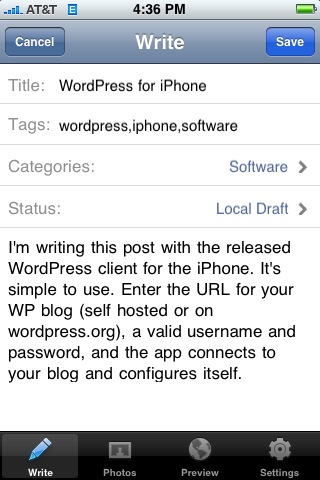
I’m writing this post with the released WordPress client for the iPhone. It’s simple to use. Enter the URL for your WP blog (self hosted or on wordpress.org), a valid username and password, and the app connects to your blog and configures itself.

As you can see below, not only does the client support categories and tags, but photos as well. You can either incorporate an existing photo from your library or take a photo from within the app.

Concerns:

  • the text editor doesn’t provide any shortcuts for markup, so even creating a simple list is pretty arduous
  • the app only prompts for a password once–convenient, but a security risk. If you lose your iPhone, your blog is compromised.

Overall, though, a killer 1.0 and a good way to really mobilize blogging. I look forward to giving the app a proper shakedown next week at Tanglewood.

Update: Okay, there are a few other bugs to shake out:

  • The UI for actually posting a post is a little non-intuitive. Rather than a big Publish button, you have to change the status of the post to Published, then save the post. This is probably so that you don’t hit the button with your thumb by mistake, but it’s still a little annoying.
  • The publish process seems buggy. My post at first failed to publish–the app crashed–then published, without sending its image. To attach the screen capture, I resorted to emailing the photo to Flickr, then adding the URL to the post. Not trivial, and without copy and paste impossible to tie the photo back to the post without going to the computer.

The photo thing is annoying. The crashes on posting are a big big problem.

iPhone SalesForce app: free, but access = $

A quickie I left out of my original iPhone app roundup: I wasn’t able to get the mobile SalesForce client working. The reason is, in retrospect, unsurprising: our company doesn’t have an “unlimited” SalesForce license, and customers on cheaper plans will be nickeled and dimed to use the app.

It’s good to see that some nasty business models are going to survive on the iPhone platform. So is my response: the SalesForce app is deleted.

iPhone App Store, Day 1


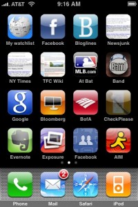
After I played around a bit with the new firmware, I got on the App Store and started downloading. I got my hands on Exposure, MLB.com At Bat, Band, the Google app, Bloomberg, the BofA app, CheckPlease, Evernote, Facebook, AIM, Jott, midomi, the AP’s Mobile News, NetNewsWire, Remote, Salesforce, iPint, and PhoneSaber. I won’t be able to review each of them, but a few quick thoughts on the ones I’ve tried:

  • iPint: deleted. Not enough fun to make up for the big Carling logo that comes up on the beer pint at the end.
  • MLB.com At Bat: A much nicer way than the Red Sox web site to find out if Storrow Drive will be jammed up because of a home game at Fenway.
  • Exposure: I agree with The Unofficial Apple Weblog: Photos Near Me is creepy but kind of a cool way to explore the area around you. It was with Exposure that I first saw the request to use my location, and I was relieved to see it again this morning. Apparently authorizing the release of your location data is not just a one time thing. The app is a little slow over Edge, though.
  • BofA: doesn’t seem that much improved over their mobile web experience. A few of the graphics appear to be included in the app, but most of the rest is just like the website. Of course, the automatic location based ATM finder is good, but is that enough of a reason to install an app, even if it is free?
  • PhoneSaber: a giggle and a fun demo of the phone’s capabilities. What would be really cool is if you had two iPhones running PhoneSaber, and you could tell that they were near each other, that you could do a real duel.
  • Band: Bought it for the keyboard. Love it for the 12 bar blues mode.
  • Bloomberg: is slow over Edge, but not as slow as I would have guessed. Missing: a way to share stories from Bloomberg News.
  • Jared: Oh, Jared. So glad to see my old friend here. The voice of the Butcher of Song has not improved with age, and that’s how we like it. (Incidentally, does Jared win the award for the app ported to the most Apple programming environments? Classic, Newton (!), Mac OS X app, Mac OS X Dashboard widget, iPhone…)

Regarding the economics and revenue model from the App Store: First, I have to give kudos to the folks at MacRumors and TechCrunch for their ingenuity. Alas, it looks like they spilled the beans too soon, as all download counts have been re-zeroed out. But the preliminary indications ($55K in revenue from the US store before it even opens) should hopefully prove the viability of the revenue model.

And I definitely echo Daring Fireball’s point about the store’s reliability, a point thrown into even sharper relief by the fact that MobileMe is, as I speak, continuing to stagger about like a starlet in rehab: very pretty, a promising future, and completely incapable of standing upright for more than a few minutes at a time.

iPhone Firmware 2.0, Day 1

When I got home last night, I tried Software Update and found iTunes 7.7, but it didn’t find the new iPhone firmware. So I tried the path laid out in the TechCrunch post of direct downloading the firmware package. Tip: use Firefox. Safari automatically expands the package, and while there’s probably a way to re-zip it so that iTunes will recognize it, it’s easier to download it with a browser that doesn’t automatically unzip.

I plugged my phone in and started the firmware upgrade process. Then I went off to do something time consuming (the upgrade using this method performs a full backup, wipe, and restore, and full restore takes a while if some of your content, in my case music, is coming from a network attached disk). So after spending time on our basement project (and getting hands liberally covered with microscopic dots of primer), I finally got on my iPhone to start checking out some of the new features.

First: there’s gotta be a better way to manage application icons than just spreading them over three or four screens as they get installed. Yes, obviously I can manually spread them out over screens, but I found myself yearning for … folders. Or something. I think some of the jailbreaker guys may have come up with some concepts that would be worth copying buying here.

Second: man, it’s great, but also weird, to have mail coming in in the background without my manually fetching it. And it’s great, and not weird at all, to be able to delete multiple mail messages at once. That’s the killer feature for me right there. No more slide–click Delete–slide–click Delete–repeated ad infinitum.

I’m really, really glad that Apple made the Contacts feature an application instead of burying it in the phone menu. That was one thing that always made me wonder: why did the designers think that the only time I would need access to my contacts was when I was making a phone call?

I was hoping to give the VPN and Exchange integration features a crack, but I need to get some settings from our IT guy and he’s not in; that will have to be a later post.

The on-phone App Store is very nice. I frankly found browsing the store through iTunes to be something of a pain, and the experience on the phone is much nicer. I don’t know why–perhaps it’s the fact that the browse views in the store don’t show the app icons?

The scientific calculator is a nice blast from the past. One minor quibble–I hadn’t realized until playing with it that the calculator uses a font with proportional width numbers. It’s not noticeable unless you’re rapidly changing the numbers in the display–say, by repeatedly hitting the Rand or sin buttons–but seeing the leading zero jiggling around in response to the keypresses is a little disconcerting.

Mobile Safari hasn’t crashed on me yet. It used to reliably crash on loading certain long or complex pages. So that’s something.

Oh, and those nice screenshots? Built in feature. Hold the main button and tap the power button, and a screenshot is saved to your Pictures, where you can email it or upload it (if MobileMe is working).

So that’s the base OS: nice, and featureful. But of course the excitement of the new firmware is the App Store, so we’ll talk about that next.

The iPhone App Store is live

TechCrunch reports, and I can confirm, that the App Store is live. It’s not linked from the store navigation, but if you install iTunes 7.7, you can click through to the list of iPhone apps. The categories are pretty unsurprising: Business, Education, Entertainment, Finance, Games, Healthcare & Fitness, Lifestyle, Music, Navigation, News, Photography, Productivity, Reference, Social Networking, Sports, Travel, Utilities, Weather. And a few interesting finds, including a Bloomberg app, a location-aware Bank of America app, OmniFocus, SalesForce Mobile, Oracle Business Indicators, the AP’s news app (with no mention of being able to send photos back to the AP; whassup?), NetNewsWire, MooCow’s Band, and about 175 games.

Including Jared. (Happy dance.)

Update: According to TechCrunch and CNET, you can download the firmware now, though it’s a direct download rather than through Software Update. Alas, my iPhone is synced through my Mac, which is at home, so I’ll have to wait before I can try it out.

Day of updates: iPhone App Store, maybe MobileMe

Various sources report that the iPhone App Store will launch today. It’s clear that iTunes 7.7 is out, featuring the ability to control iTunes from a new free iPhone/iPod Touch app, and the New York Times says that Apple will be launching the app store.

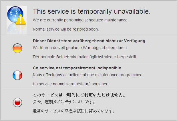
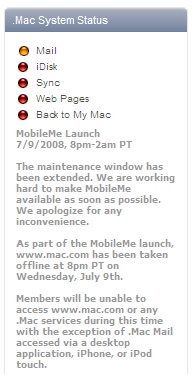
What I haven’t seen reported anywhere is anything about a MobileMe launch today. But signs are good; right now I’m getting a maintenance screen on .Mac:

Fortunately, I’m still getting mail on my iPhone. But maybe this means a MobileMe launch is imminent too.

Update: Okay, I missed the .Mac status report on Apple support that indicated that MobileMe was actually supposed to launch last night; the maintenance window was from 8 pm to 2 am Pacific time. Right now the status isn’t pretty:

Update 2: As of noon-ish on the east coast, the update now says that all services are back online except for webmail and web pages: “With the exception of the new web apps, all of the following services are available: Mail, iChat, iDisk, Sync, Back to My Mac, and all published pages, including Galleries and iWeb sites.” Smart money has it that there’s a contingency plan being executed while they figure out why the new MobileMe apps aren’t RTWing successfully.