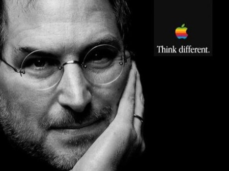
Five things I learned from Steve Jobs

Steve jobs think different

Last night’s news about Steve Jobs hit me hard. Not that it was a surprise; Steve was the one CEO I know who was most in touch with, and open about, his own mortality. Of course that was out of necessity; it’s hard to sweep pancreatic and liver cancer under the rug. But Steve’s response to it was like so much else: instead of ignoring it, he acknowledged it while publicly focusing on where things were going next.

It made me think about the lessons I carry with me as a product manager, and I suppose as a person, that are directly traceable to Steve:

Thing 1: Always look forward

Steve, and Apple as his company, never hesitated to sacrifice backwards compatibility or even whole product categories if they sat in the way of something better. Viz: a whole long list of things–the 3.5″ floppy drive (which Apple helped popularize), ADB, SCSI, and even hard drives and optical media (on the MacBook Air, at least). PowerPC support. Mac OS Classic.

For most of this list, I don’t think we miss the items. And certainly we couldn’t have the products that we have today if Apple had continued to hold onto the older standards past their sell-by dates. By contrast, it’s inconceivable to me that my HP work laptop, just a year old, has a 9 pin serial port. Really? I would bet that not one in 10,000 users has any use for that port. What a lot of money and engineering QA time they’re wasting including that port in every laptop they ship.

I think one of the hardest things to do as a PM is to recognize the things that are standing in the way of your success, especially if they’re features, technologies, compatibility points, that your customers are using. Steve Jobs’ Apple was always the evidence that if done correctly, moving beyond outdated features and standards could have enormous payoffs for you and your customers.

Thing 2: Do fewer things better

When I was a young developer, just starting out, I wanted to make everything I did like the Mac. I wanted to simplify, to reduce the number of options, to make everything clean to use. It turned out to be really hard, and to require a lot of engineering to make things clean and to just work right. But it was almost always worth the payoff.

As a product manager, it’s a lot harder. Instead of keeping a user interface simple, you’re keeping a product offering simple. But again, the payoff is enormous: having an offering that does something so well that it blows everyone’s mind is so much better than a kitchen sink offering that is “just good enough” to check boxes on someone else’s feature chart. There’s time to expand to other areas of the feature chart, if you want to, but make sure they’re done well first.

Thing 3: Think big

The iPod was never about selling hard drive based music players. It was about turning a corner in so many ways: getting Apple into the selling-content-online business, which became the App Store business a few years later; changing how people consumed music, which arguably saved the music industry from Napsterization (though I suppose few RIAA members would stand up and thank Steve for doing so); even transforming Apple from a computer company into … well, how would you characterize Apple today? Maybe a personal computing device company?

Everybody else’s iPod follower was about selling hard drive based music players. There wasn’t a broader vision about changing the market, the customer’s behavior, or how the company was oriented. No wonder they all flopped.

Thing 4: Emotional connections matter

In technology this is such a weird perspective to have. These things we build, they’re just chips and transistors, right? Just bits. But to the people using them, they’re about getting things done that, if they’re worth doing, have a real impact on their lives. Carrying your music anywhere you go. Connecting the Internet to you in the palm of your hand. Creating a great reading and video experience in the iPad. Making computing so simple a four year old could do it. Connecting people in real and tangible ways.

Talking about features, clock speed and such, doesn’t cut it. This is one area where watching the post-Steve Apple will be telling. There was a fair amount of clock-speed talk in the iPhone 4S rollout, and maybe there should have been a little more storytelling.

Thing 5: Life is short; ignore the haters

I think this last one goes to the question of Steve’s awareness of his own mortality. He summed it up in his 2005 commencement address at Stanford, a year after his initial diagnosis of pancreatic cancer, in which he said:

No one wants to die. Even people who want to go to heaven don’t want to die to get there. And yet death is the destination we all share. No one has ever escaped it. And that is as it should be, because Death is very likely the single best invention of Life. It is Life’s change agent. It clears out the old to make way for the new. Right now the new is you, but someday not too long from now, you will gradually become the old and be cleared away. Sorry to be so dramatic, but it is quite true.

Your time is limited, so don’t waste it living someone else’s life. Don’t be trapped by dogma — which is living with thae results of other people’s thinking. Don’t let the noise of others’ opinions drown out your own inner voice. And most important, have the courage to follow your heart and intuition. They somehow already know what you truly want to become. Everything else is secondary.

Steve, we owe you a lot, but maybe more than anything else, we owe you for that.

Apple iPad: first reactions

Four reactions that I agree with (parts of) in response to Apple’s iPad announcement yesterday:

  • Doc Searls places the iPad in the context of vertical integration (apps all the way down to CPUs) and horizontal playing fields and says, “What you have to appreciate, even admire, is how well Apple plays the vertical game. It’s really amazing. What you also have to appreciate is how much we also need the horizontal one. The iPad needs an open alternative, soon.”
  • Dave Weinberger says that the iPad is the “future of the past of books” and says it’s missing interactivity and collaboration as key features.
  • John Gruber says that the iPad user experience feels like it’s all about speed, and says that Apple’s vertical integration play (the aforementioned Apple A4 chip) is responsible, and that “this is Apple’s way of asserting that they’re taking over the penthouse suite as the strongest and best company in the whole ones-and-zeroes racket” ahead of Sony, Nokia, and Samsung.
  • Michael at Cruftbox sums up the reactions of the rest of the world and says, “You’ll bang on about features, data plans, DRM, open source, and a multitude of issues. You’ll storm the message boards, wring your hands, and promise you won’t buy one till ‘Gen 2.’ The din will grow and grow as time passes. And then one day, in a few months, you will actually hold one and use it. And you will say, ‘I want one. Iwant one right now.'”

I think what disappointed me about the launch was not the device but the position it occupies. Jobs sees the iPad as occupying empty space in the consumer world between a PC (laptop) and phone. And there is probably room in that position. But the iPad seems also to be firmly positioned, at least for now, as a companion device. You sync it to another computer over iTunes. There’s no USB port or optical drive. It’s not going to be replacing anyone’s laptop any time soon.

And, frankly, that’s what I was hoping it would do. Because while it looks like it blows away its target use cases (web browsing, mail, calendar, gaming, music, book reading, even office apps), there are some very real use cases it doesn’t handle. And not just being a development platform. Like:

  • Preparing taxes (though Intuit could probably do a tax application for it)
  • Scanning documents (no USB port…)
  • Printing (ditto–though I wonder if it supports network based printing?)
  • Videoconferencing (no camera and no ports)
  • Organizing photos
  • Making a calendar or Christmas card

Additionally, I have question marks about some of the use cases that it seems to handle well otherwise. Like: can I point its version of iTunes at my 500 GB network drive and play music from there? How do the new iWork apps manage their files? (Remember, there is no user visible file system on the iPhone OS, on which the iPad is based.)

But, my quibbles aside, I have to confess that I’ve already talked with my wife about getting one. We’re pretty excited for the brave new iPad future. Because for most of what it does, it does beautifully.

Genius take II: indeed.

After last night’s disaster, I decided to give iTunes 8 another try. This time I made sure my library settings were correct in advance, and let it collect and submit the information while I ate dinner. No spinning beachball, no issues, this time around. 

So, Genius. I’m not evaluating the sidebar right now (though I will note that the message that appears when Genius can’t find any recommendations in the store is a pretty good predictor of whether the Genius playlist feature will work. And you know what? It does work, quite well.

The feature in a nutshell is a little like an old bar game: pick a song, then identify a bunch of other songs that go with it. All the songs are pulled from your library and you can vary the length of the playlist, and save it into your library if you choose. Pretty simple. So I decided to throw it some curves. First, “Nuki Suki” by Little Richard. It took this slightly profane funk gem from the master and mixed it with “Sexy MF,” “There Was a Time,” “Baby I Love You,” “The Hook and Sling” by Eddie Bo, “Up for the Down Stroke,” and Marvin Gaye’s “You Sure Love to Ball.” There were a few clinkers as well, like Ready for the World’s “Oh Sheila,” but at least everything was in the ballpark. 

So I tried something a little different: a movement from “Jesus’ Blood Never Failed Me Yet” by Gavin Bryars, from the recording with Tom Waits on vocals. What came back seemed to be mostly related to Tom Waits rather than Gavin Bryars: tracks from Waits, Smog, the Black Keys, the Cocteau Twins, Cat Power, and so on. So I tried another Bryars track but Genius couldn’t find matches. Also matchless: tracks from the Virginia Glee Club and the Virginia Gentlemen, probably because they aren’t available in the iTunes Store. But mixes around Hilliard Ensemble, Pink Floyd, Jane Siberry, Steinski, Jeff Buckley, and Neko Case were all pretty solid.

So I think those of us that like genre-busting mixes and unusual juxtapositions are probably safe: Genius doesn’t automate what we do just yet. But for a good 25 song groove it’s not bad, and for most people it will handily replace Shuffle as a way to plumb the depths of their library.

iTunes 8: first impressions

I installed iTunes 8 last night on my home machine, a MacBook Pro with 2 GB of RAM. The update wasn’t in Software Update, so I pulled it off Apple’s website. Then I had to update to get the latest QuickTime, begging the question of why they aren’t packaged together. But that was straightforward enough. Then I rebooted and fired up iTunes.

First it wanted to update all my album art–I suppose to build new thumbnails for the new grid view. When it finished looking at my 26,000 song library in five minutes I was suspicious. Sure enough: it had forgotten that my music lived on a network drive and silently reset the location to my laptop hard drive, causing all the songs in the library to be unplayable. Fortunately I’ve been through this before: Preferences, Advanced, and set the correct location for the folder, then wait fifteen minutes while all the song paths are reset. But man: I was really hoping Apple had fixed this one. I don’t restart iTunes often, but when I do I have to go through this dance more than half the time.

But OK: so far no worse than the old version.

The new grid view seemed nice enough, until I clicked something. Then it locked up tighter than a drum with a spinning beachball. About five minutes later the beachball cleared and I was able to play some music. I found of interesting that the grid view was only present some of the time. If I clicked through on the Jazz genre, it brought up the classic view of tracks next to album art. Maybe this was because of the number of albums (330) in the genre, but I found it a little disorienting.

Then: Genius. I don’t know if I would have called the feature that, since it has to upload the entire library to the cloud before it can work. I let it run for awhile but it wasn’t long before the spinning beach ball returned. I finally killed iTunes but it managed to keep any other application, including QuickTime, from playing any sound until I rebooted.

And when I rebooted, iTunes forgot where the music library was again.

I think Genius has promise–it came up with some interesting recommendations on my work computer. But that only has thirty songs on it. I have a suspicion that it doesn’t scale. At all.

New iPods, new iTunes. It must be September

Apple’s really changed as a company; I remember when September was Back to School month and you’d find out about new iMacs, a new version of iLife, whatever. Now it’s all iTunes and iPod.

I like the look of the new iPod nano, and the price point ($150 for 8 GB) and form factor are sweet. But I’m particularly impressed with the software and the use of an accelerometer in what is basically a low end device. CoverFlow is a killer interface, especially in a small device, and seeing it on the nano is pretty sweet.

I’m keen to see whether the new “genius” features in iTunes scale up to my 26,000 song music collection. Hopefully by the time I’m home tonight, iTunes 8 will be downloadable (it’s still 7.7 from where I sit right now).

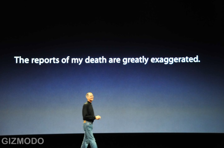
But I think my favorite visual from today’s event was this one:

Apple: MobileMe isn’t really using “push” with your PC

MobileMe (aka former .Mac) subscribers received an overdue email from the MobileMe team today, apologizing for the rocky roll-out of the new service and extending a free month of service to all subscribers.

The email contained the following interesting paragraph:

Another snag we have run into is our use of the word “push” in describing everything under the MobileMe umbrella. While all email, contact or calendar changes on the iPhone and the web apps are immediately synced to and from the MobileMe “cloud,” changes made on a PC or Mac take up to 15 minutes to sync with the cloud and your other devices. So even though things are indeed instantly pushed to and from your iPhone and the web apps today, we are going to stop using the word “push” until it is near-instant on PCs and Macs, too.

What a welcome breath of fresh air: unambiguous retraction of unjustified marketing hype!

As a product manager, it strikes me that the team managing the rollout did an excellent job of damage control: fix the operational problems, apologize to the customers, change the marketing message where it’s out of line with the new reality, extend credit and move on. And they’ve done a good job. I even have to retract my characterization of MobileMe as the Lindsey Lohan of webmail services (last paragraph).

iPhone App Store, Day 1


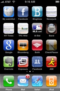
After I played around a bit with the new firmware, I got on the App Store and started downloading. I got my hands on Exposure, MLB.com At Bat, Band, the Google app, Bloomberg, the BofA app, CheckPlease, Evernote, Facebook, AIM, Jott, midomi, the AP’s Mobile News, NetNewsWire, Remote, Salesforce, iPint, and PhoneSaber. I won’t be able to review each of them, but a few quick thoughts on the ones I’ve tried:

  • iPint: deleted. Not enough fun to make up for the big Carling logo that comes up on the beer pint at the end.
  • MLB.com At Bat: A much nicer way than the Red Sox web site to find out if Storrow Drive will be jammed up because of a home game at Fenway.
  • Exposure: I agree with The Unofficial Apple Weblog: Photos Near Me is creepy but kind of a cool way to explore the area around you. It was with Exposure that I first saw the request to use my location, and I was relieved to see it again this morning. Apparently authorizing the release of your location data is not just a one time thing. The app is a little slow over Edge, though.
  • BofA: doesn’t seem that much improved over their mobile web experience. A few of the graphics appear to be included in the app, but most of the rest is just like the website. Of course, the automatic location based ATM finder is good, but is that enough of a reason to install an app, even if it is free?
  • PhoneSaber: a giggle and a fun demo of the phone’s capabilities. What would be really cool is if you had two iPhones running PhoneSaber, and you could tell that they were near each other, that you could do a real duel.
  • Band: Bought it for the keyboard. Love it for the 12 bar blues mode.
  • Bloomberg: is slow over Edge, but not as slow as I would have guessed. Missing: a way to share stories from Bloomberg News.
  • Jared: Oh, Jared. So glad to see my old friend here. The voice of the Butcher of Song has not improved with age, and that’s how we like it. (Incidentally, does Jared win the award for the app ported to the most Apple programming environments? Classic, Newton (!), Mac OS X app, Mac OS X Dashboard widget, iPhone…)

Regarding the economics and revenue model from the App Store: First, I have to give kudos to the folks at MacRumors and TechCrunch for their ingenuity. Alas, it looks like they spilled the beans too soon, as all download counts have been re-zeroed out. But the preliminary indications ($55K in revenue from the US store before it even opens) should hopefully prove the viability of the revenue model.

And I definitely echo Daring Fireball’s point about the store’s reliability, a point thrown into even sharper relief by the fact that MobileMe is, as I speak, continuing to stagger about like a starlet in rehab: very pretty, a promising future, and completely incapable of standing upright for more than a few minutes at a time.

iPhone Firmware 2.0, Day 1

When I got home last night, I tried Software Update and found iTunes 7.7, but it didn’t find the new iPhone firmware. So I tried the path laid out in the TechCrunch post of direct downloading the firmware package. Tip: use Firefox. Safari automatically expands the package, and while there’s probably a way to re-zip it so that iTunes will recognize it, it’s easier to download it with a browser that doesn’t automatically unzip.

I plugged my phone in and started the firmware upgrade process. Then I went off to do something time consuming (the upgrade using this method performs a full backup, wipe, and restore, and full restore takes a while if some of your content, in my case music, is coming from a network attached disk). So after spending time on our basement project (and getting hands liberally covered with microscopic dots of primer), I finally got on my iPhone to start checking out some of the new features.

First: there’s gotta be a better way to manage application icons than just spreading them over three or four screens as they get installed. Yes, obviously I can manually spread them out over screens, but I found myself yearning for … folders. Or something. I think some of the jailbreaker guys may have come up with some concepts that would be worth copying buying here.

Second: man, it’s great, but also weird, to have mail coming in in the background without my manually fetching it. And it’s great, and not weird at all, to be able to delete multiple mail messages at once. That’s the killer feature for me right there. No more slide–click Delete–slide–click Delete–repeated ad infinitum.

I’m really, really glad that Apple made the Contacts feature an application instead of burying it in the phone menu. That was one thing that always made me wonder: why did the designers think that the only time I would need access to my contacts was when I was making a phone call?

I was hoping to give the VPN and Exchange integration features a crack, but I need to get some settings from our IT guy and he’s not in; that will have to be a later post.

The on-phone App Store is very nice. I frankly found browsing the store through iTunes to be something of a pain, and the experience on the phone is much nicer. I don’t know why–perhaps it’s the fact that the browse views in the store don’t show the app icons?

The scientific calculator is a nice blast from the past. One minor quibble–I hadn’t realized until playing with it that the calculator uses a font with proportional width numbers. It’s not noticeable unless you’re rapidly changing the numbers in the display–say, by repeatedly hitting the Rand or sin buttons–but seeing the leading zero jiggling around in response to the keypresses is a little disconcerting.

Mobile Safari hasn’t crashed on me yet. It used to reliably crash on loading certain long or complex pages. So that’s something.

Oh, and those nice screenshots? Built in feature. Hold the main button and tap the power button, and a screenshot is saved to your Pictures, where you can email it or upload it (if MobileMe is working).

So that’s the base OS: nice, and featureful. But of course the excitement of the new firmware is the App Store, so we’ll talk about that next.

The iPhone App Store is live

TechCrunch reports, and I can confirm, that the App Store is live. It’s not linked from the store navigation, but if you install iTunes 7.7, you can click through to the list of iPhone apps. The categories are pretty unsurprising: Business, Education, Entertainment, Finance, Games, Healthcare & Fitness, Lifestyle, Music, Navigation, News, Photography, Productivity, Reference, Social Networking, Sports, Travel, Utilities, Weather. And a few interesting finds, including a Bloomberg app, a location-aware Bank of America app, OmniFocus, SalesForce Mobile, Oracle Business Indicators, the AP’s news app (with no mention of being able to send photos back to the AP; whassup?), NetNewsWire, MooCow’s Band, and about 175 games.

Including Jared. (Happy dance.)

Update: According to TechCrunch and CNET, you can download the firmware now, though it’s a direct download rather than through Software Update. Alas, my iPhone is synced through my Mac, which is at home, so I’ll have to wait before I can try it out.

Day of updates: iPhone App Store, maybe MobileMe

Various sources report that the iPhone App Store will launch today. It’s clear that iTunes 7.7 is out, featuring the ability to control iTunes from a new free iPhone/iPod Touch app, and the New York Times says that Apple will be launching the app store.

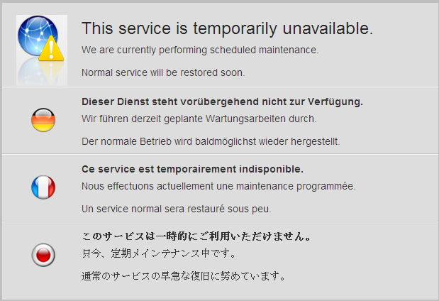
What I haven’t seen reported anywhere is anything about a MobileMe launch today. But signs are good; right now I’m getting a maintenance screen on .Mac:

Fortunately, I’m still getting mail on my iPhone. But maybe this means a MobileMe launch is imminent too.

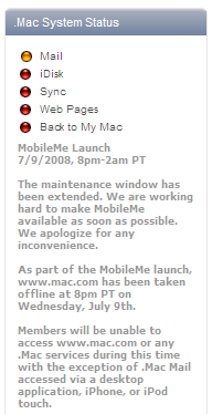
Update: Okay, I missed the .Mac status report on Apple support that indicated that MobileMe was actually supposed to launch last night; the maintenance window was from 8 pm to 2 am Pacific time. Right now the status isn’t pretty:

Update 2: As of noon-ish on the east coast, the update now says that all services are back online except for webmail and web pages: “With the exception of the new web apps, all of the following services are available: Mail, iChat, iDisk, Sync, Back to My Mac, and all published pages, including Galleries and iWeb sites.” Smart money has it that there’s a contingency plan being executed while they figure out why the new MobileMe apps aren’t RTWing successfully.

WWDC Part III: iPhone 3G

Addressing the main challenges: 3G, more countries, more affordable. Camera still on the back (no live videoconferencing on the iPhone), but the headphone port is not recessed so that’s a plus.

I knew it: the speed test is back. Now we’re not benchmarking Mac Pro towers against Dells on Photoshop, we’re playing mobile web browsers against each other.

It’s got GPS!

It’s $199 for an 8 MB phone! $299 for a 16 MB one! Very very cool, he said weeping remembering how much I paid for mine. The cost of early adoption.

Keynote is over. There will be news about Snow Leopard later today, but that’s enough news for now.

WWDC Part II: MobileMe

Phil Schiller announces MobileMe: “Exchange for the rest of us.” This ties up a long standing question about the MobileMe trademark that’s been around since 2006. Cloud-based synching for email, calendar, addresses. With rich Ajaxy goodness on the browser experience. Looks great. It’s supposed to be on me.com according to Phil, but that page shows that it used to be owned by a site that’s now called Snappville from where I’m accessing it. I think the DNS changes haven’t propagated to the East Coast yet.

MobileMe replaces .Mac. We hardly knew ye. Sniff.

WWDC Liveblogging the livebloggers

It’s hot here in Burlington, MA, pushing 98, but it must be even hotter in the Moscone Center with the liveblogging that’s going on right now. I’ve been looking at Engadget, CNet, Gizmodo, and TechCrunch for the updates. So far TechCrunch is up and down like a drunken sailor and Gizmodo is the fastest and most responsive.

News so far: there will be a 10.6 called “Snow Leopard,” and Steve’s gonna update him some iPhone.

iPhone points of interest: reiterating the enterprise features announced when the SDK was announced, including Exchange support, native Cisco integration. I note that all the liveblogging sources describe these as features of the iPhone 2.0 software, not the iPhone 2.0 itself; this holds out hope that my 1st gen model is good for at least one upgrade.

The SDK demo includes a feature called Core Location. I don’t even want to think how many business plans in my entrepreneurship class at Sloan back in 2001 imagined a similar feature for mobile phones, breathless with the knowledge that the government was going to require carriers to be able to triangulate handsets down to a few hundred meters to support 911 calls. Mobile dating service…on your handset! With…. contextually relevant ads!!!$! Maybe this iteration will give us some more imaginative apps for location technology.

I love that Sega is the first ISV to demo an app here. Again: iPhone is mobile gaming platform.

eBay mobile client: yawn. Facebook and Bloglines made more impressive mobile apps just by working in the browser, guys. You had 95 days on the SDK and this is all you could build?

Loopt demo. Regarding my note above… no, not really, unless you count integration with Google maps.

The TypePad client looks interesting. Wonder if it’ll work with WordPress?

The AP iPhone client is kind of brilliant in a way nothing else here is–because it not only sends down AP content, it allows you to send it up! Crowdsourcing the news at its finest.

I kind of like the piano simulator from Moo Cow Music. Their site is down but there’s a YouTube video of their demo (thanks, Google Cache).

(All these demos, btw, are called “demonstrating momentum.” I’m waiting for them to trot out that SalesForce demo again just to drive the point home to Wall Street.)

First new feature: central (Apple provided) push notification for all background apps. How well will that scale if Apple can’t even keep Webmail for .Mac running? Saying “it’ll scale” without details is a little sketchy in the post-Twitter world.

Free update for current iPhone owners = good.

Radiohead on iTunes, five years on

Five years and almost a month ago, I wrote a post called Interesting absence(s) about the disappearance of Radiohead and Sigur Rós from the then-new iTunes Music Store. When I expanded it for Blogcritics, I laid a finger on one of the causes—friction between artists and labels over digital rights and reimbursement. At the time I thought it might take a few months or a year before the Radiohead catalog returned. It only took Sigur Rós until February of 2004 to return, but it took until this week for the Radiohead back catalog to reappear, and then only after In Rainbows proved such a hit on the service.

The Red Herring post makes a few points about the reasons bands hold out, but they don’t answer one question: why is Radiohead only dipping its toe in? There is only one EP on the service, meaning only two non-album tracks, compared to other artists like U2 and Sting who have been far more generous with posting digital rarities—which fans like myself would be motivated to shell out cash for. Perhaps it’s only a matter of time.

(Confidential to Matt F: Hey, Fish, see what you can do about getting Thom and the boys to post some more b-sides and exclusives, won’t you? Much love.)