Screenshots in software user documentation

I’ve been up to my eyeballs in user doc recently, our software-as-a-service product offering having matured to the point that novice users need some guidance to get started with the software. This being a startup, we don’t have a tech writer, and I’ve added the relevant hat to my normal product management job–and rediscovering my deep respect for the profession.

A tech writer has to know the software better than anyone else from the user’s perspective, and has to understand the compromises, incomplete implementations, and other hazards of software well enough to explain to the user how it’s supposed to work in a clear, intuitive way. Tech writing reminds me of Henry Miller’s description of proof-readers in Tropic of Capricorn, which I took many years ago as a motto while working on the production of the second or third issue of Rag & Bone:

The world can blow up — I’ll be here just the same to put in a comma or a semi-colon. I may even touch a little overtime, for with an event like that there’s bound to be a final extra. When the world blows up and the final edition has gone to press the proof-readers will quietly gather up all commas, semi-colons, hyphens, asterisks, brackets, parentheses, periods, exclamation marks, etc., and put them in a little box over the editorial chair. Comme ça tout est réglé…

…A good proof-reader has no ambitions, no pride, no spleen. A good proof-reader is a little like God Almighty, he’s in the world but not of it.

So tech writers are a little like proof-readers–the release may blow up, but the tech writer will still be there updating the user documentation and taking the latest screenshots.

Which brings me around to the question at hand: the tension between the need for screenshots in documentation and the definitive non-agileness of it all. A thread on the Joel on Software Discussion Group questions the need for screenshots entirely but comes around to the concept that, yes, you have to retake the screenshots every time you update the GUI, and yes, it’s a pain in the butt, but it’s part of the cost of doing business. I was hoping for some more practical guidance: is there a rule of thumb on what to illustrate with a screenshot and what to leave out?

Test driving Google Reader

One of the downsides of being an early adopter in some areas is that I’m a late adopter in many others. I was using a desktop RSS aggregator back in 2002 (Radio Userland, then NetNewsWire) and so came late to the web-based news aggregator market. When I did hop on board, I used Bloglines, one of the early web based aggregators, and so missed out on Google Reader. I’ve stuck with Bloglines because it works and because it works well on the iPhone.

Yesterday, Bloglines wasn’t working. I haven’t seen anything posted about this, but while the site’s UI was up I didn’t get any new results for any of my 175 feeds from about 11 AM on. So in the early afternoon I decided to give Google Reader a spin.

One of the nice things about feed readers is that it’s pretty easy to take all your feeds to a new reader, thanks to OPML (one of Dave Winer’s many innovations in this area). Most feed readers support exporting your feed list to OPML, a structured XML format, and support importing feed lists from OPML. So you can pack up your feeds and easily bring them to a new place–minimizing vendor lock-in. I did that with my Bloglines feeds and was up and running quickly in Google Reader.

One thing that struck me almost immediately was the poorer UI in Google Reader. While it uses the same left pane navigation–right pane reading metaphor as Bloglines, the left pane is cluttered with a bunch of stuff on the top–starred items, trends, shared items and notes, a big help pane, and THEN your list of feeds. Bloglines’ feed list takes up the whole left pane and is just your content–much easier to manage–while other information like your personal blog and “clippings” are in separate tabs. If you’re just interested in reading feeds, Bloglines’ navigation is easier and less cluttered.

The right pane UI is a little better too, imho. I find the separate drop-shadowed feed boxes in the expanded view (what NetNewsWire used to call “smash view”) distracting; Bloglines’ zebrastriped list is visually flatter and doesn’t get in the way of the content. And I can’t imagine a use for the list view for most of my RSS feeds; though perhaps the notification-only ones are better suited for this kind of presentation, I can’t imagine trying to read BoingBoing or even Krugman this way.

Google Reader does feel a little snappier–feeds update more frequently and quicker. But the reading experience is actually slower, because items don’t get marked as read on display, but only if you scroll them off the screen. That might be beneficial for some people, but I’m a quick scanner and like to run through the feed list quickly. And because Google Reader doesn’t fetch all the items in a folder at once, dynamically fetching items as the user scrolls, there’s no way to quickly scroll to the bottom and read everything all at once. You have to wait for the fetch to catch up, then scroll to the bottom again.

So this morning I was pleased to see Bloglines is back online. I’ll still test out the Google Reader iPhone experience, because there are things that don’t quite work for me in Bloglines’s. But I’ll be continuing to use Bloglines in my browser.

Technical Debt part II: Security debt

I wrote previously about “technical debt,” the concept that the decision to defer necessary technical work (adopting an updated version of a new component, refactoring code to reduce cruft, etc.) accumulates across releases until it absorbs a project team’s entire capability to develop code. You “pay interest” on technical debt because it’s much harder and consumes many more resources to make a necessary technical change the further downstream you get from the point where the change becomes necessary.

It occured to me today that there’s a specific flavor of technical debt, security debt, that is both more insidious and much easier to see in operation, because we have so many prominent examples of it. It might not have cost the developers of Windows too much more to make the OS more secure at design time, but some of the decisions were deferred, until the point where you had whole features introduced to address security deficiencies in prior features, and the six month long security push that postponed Vista’s launch while the team took care of outstanding security issues in the already-shipped version of the OS.

What’s interesting about security debt to me is that it balloons over time. My once-favorite mix sharing site, Art of the Mix, is a good example. The guy who developed it didn’t really understand SQL injection or XSS, or at least didn’t code defensively against them, and it’s become a hive of malware as a result–and is now flagged as a “reported attack site” and blocked by Firefox 3. So, to carry the metaphor to its logical conclusion, the site’s security debt drove it into a kind of “bankruptcy” when it proved susceptible to drive-by SQL injection attacks.

So how do you avoid incurring security debt? Learning good development practices is a good start; keeping up on the prevalent attacks–the current risk space–is another. But there’s one key thing to remember about security debt: in many cases fixing the underlying flaw that permits exploitation is far far cheaper than getting hacked, or even putting bandaids like web application firewalls in place.

Keep your hands and feet inside the car at all times…

…because something tells me this race is going to be a rollercoaster for the next few weeks.

Screenshot below from the excellent Election ’08 iPhone App, from Pollster.com and Slate. For a more nuanced view, look to the fine folks at Electoral-Vote.com, which shows Obama’s lead 338 to 185 electoral votes, with 15 ties. This high margin is pretty new in the race–back in early September, the lead was only about 100 electoral votes.

For more context, check out the historical trends on Electoral-Vote.com, where you can see what happens if you don’t count the states with a less than 5% margin of victory (answer: we don’t have a clear winner yet).

WordPress gives a window into user experience design

With the WordPress 2.7 Navigation Options Survey, the fine folks at WordPress.org have opened the kimono on one of the trickiest product management tasks: user experience design. The context: the administrative interface of WordPress. The UI was famously redesigned earlier this year by Happy Cog studios, who applied a rigorous information architecture along with a highly readable visual style. So why redesign now?

Well, it appears that users didn’t like the way the dashboard used screen real estate. While the WordPress team doesn’t describe what the users complained about, the key navigation options are currently along the top, and I would guess that users who have widescreen monitors are pointing out that horizontal screen real estate is less precious than vertical. So the team has created a survey to get user feedback about some design options.

This is a tricky task, and it could have been made a little easier by some better user requirements gathering. For instance, what the team is fundamentally trying to do in identifying top-level command categories is classically served by “card sorting,” a classic usability design exercise. They might get better feedback by doing a card-sort study, either offline or with a software package like WebSort.

Second, the presentation of the choices doesn’t include a control. It assumes that all users prefer the vertical menu and presents variations on that option. Adding an option for the existing horizontal menu might present some valuable information on how users feel about the existing option.

My opinion may be tainted by my personal preferences; I’m one who finds the current administrative interface design preferable to what I’ve seen so far of the new direction. But regardless of my personal feelings, there’s something to be said for rigorous user centered design in determining the next direction.

Getting attention

There’s a cute comic up at WPLover that highlights an interesting UI trend: the rise of the speech bubble. If you don’t have a WordPress blog, you may never have seen this UI, but it’s pretty much as the comic strip shows it. In the dashboard UI, there are a series of tabs for common tasks–comment management, etc.–and if something needs your attention on one of those tabs, a “speech bubble” pops up with the number of things you need to address.

What the comic points out is that this makes perfect sense for comments (a speech bubble with the number of comments is a congruent metaphor). But indicating the number of plugins needing updates is a little different–should your WordPress plugins really be talking to you?

I think the first treatment of this concept that I saw was Apple’s new mail count in Mail.app, but they didn’t treat it as a speech bubble (there was no “tail” on the little red badge showing the count). This treatment is probably the more portable UI convention.

WordPress 2.6.1 is out

After the difficulty I had with the WordPress 2.6 upgrade, I was both hopeful that 2.6.1 would fix some of the bugs, and a little hesitant about the upgrade. Apparently both my anticipations were incorrect. WordPress 2.6.1 was released yesterday, and while there’s no explicit mention of the admin cookie bug that I hit on the 2.6 upgrade, my own upgrade to 2.6.1 was pretty easy.

The full fixed bug list is on the WordPress Trac, so you may want to see if there’s any fixes you need. As another commenter pointed out, there are few security fixes, but that doesn’t mean there aren’t any–the thing about a plugin without headers not appearing on the plugins page raises concerns about hidden malware that might be worth upgrading to avoid. Just remember to clear your cookies before you try to log back into the admin console after the upgrade.

VMWare critical licensing bug

According to Matthew Marlowe’s Blog, VMWare instances running ESX 3.5U2 in enterprise configurations have a license management bug that will prevent them from starting, beginning tomorrow.

The post has turned into a list of pretty helpful tips, including:

While the licensing bug does not appear to be related to security issues, this is a pretty good reminder of how mission critical hypervisor software is. It should be held to the same standards as operating systems.

Upcoming: Business of Software 2008 in Boston

I was about to delete an email from Bob Cramblitt on my old blog, until I actually read it and realized it was relevant to at least some of my readers:

Hi Tim:

Thought you’d like to know that Seth Godin, Joel Spolsky, Jason Fried and others are coming to Boston for the Business of Software 2008 conference.  This is the only conference run by people who actually manage successful software companies.  All substance, no BS and not a Web 2.0 to be found.

Your blog readers can get $100 off registration by entering “MASS” when registering at www.businessofsoftware.org.

So there you go. Never let it be said that reading my blog got you nowhere. (Disclaimer: this was my only contact with Bob Cramblitt and I’m not getting anything for posting this.)

WordPress for iPhone

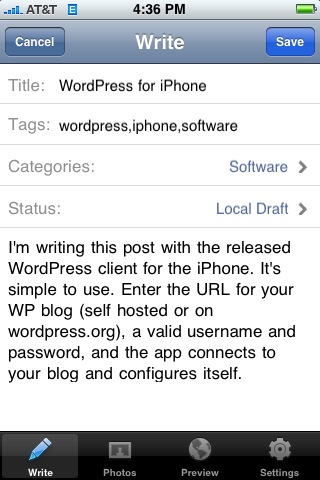
I’m writing this post with the released WordPress client for the iPhone. It’s simple to use. Enter the URL for your WP blog (self hosted or on wordpress.org), a valid username and password, and the app connects to your blog and configures itself.

As you can see below, not only does the client support categories and tags, but photos as well. You can either incorporate an existing photo from your library or take a photo from within the app.

Concerns:

  • the text editor doesn’t provide any shortcuts for markup, so even creating a simple list is pretty arduous
  • the app only prompts for a password once–convenient, but a security risk. If you lose your iPhone, your blog is compromised.

Overall, though, a killer 1.0 and a good way to really mobilize blogging. I look forward to giving the app a proper shakedown next week at Tanglewood.

Update: Okay, there are a few other bugs to shake out:

  • The UI for actually posting a post is a little non-intuitive. Rather than a big Publish button, you have to change the status of the post to Published, then save the post. This is probably so that you don’t hit the button with your thumb by mistake, but it’s still a little annoying.
  • The publish process seems buggy. My post at first failed to publish–the app crashed–then published, without sending its image. To attach the screen capture, I resorted to emailing the photo to Flickr, then adding the URL to the post. Not trivial, and without copy and paste impossible to tie the photo back to the post without going to the computer.

The photo thing is annoying. The crashes on posting are a big big problem.

Nokia + open source Symbian: too little, too late

TechCrunch: Nokia Acquires Symbian – Goes 3. Hear that sound? That’s the sound of Fake Steve Jobs just itching to skewer somebody, but since he’s on vacation I’ll do it instead.

Make no mistake: this is a defensive move by Nokia in response to the iPhone and Android, not an offensive one. Five years ago, an open source OS for smartphones might really have made the market. Now Nokia’s not even calling the tune any more: with Motorola, Samsung and LG eating them away on the low end, and RIM, the Windows Mobile folks, and Apple eating them away on the high end, pretty soon there’s not going to be much left in the middle.

I enjoyed the Symbian phone that I used from 2003 to 2005, but Symbian didn’t move quickly enough with the OS and it became stale. It doesn’t smell any better now. When you have unnamed senior execs inside Nokia calling Symbian a POS, you’ve got problems.

And what about units? Those 291 million handsets you sold in Q1? They’re legacy products. Apple sold 6 million in the iPhone’s first year as a brand new market entrant even without the benefit of enterprise mail integration or independent developers. Now granted, you can sit fat and happy on your 291 million units shipped, or you can reflect on the fact that you shipped 100 million of them in the last 18 months, and the other 100 million are in all likelihood no longer in use since your European customer base replaces its phones every 12 to 25 months, and the US customer base every 17.6. Is your market really still growing, or did you just sell replacement Symbian handsets to your existing customers?

And I haven’t even talked about Android yet–it’s probably a trainwreck, but it’s from Google so it’s going to exert some market pressure on you too.

And your developers are talking crap about the OS, too. And I can’t blame them. Which would you rather write apps for: an OS that’s forked three ways, requires you to use a crippled version of C++ with weird string handling practices and proprietary error handling, and needs a downlevel version of Visual Studio, all of a sudden the iPhone’s development frameworks and XCode look like nirvana.

So, guys: if your competition is a competitor who’s locked up the enterprise and a user centric market innovator, I’m afraid that open sourcing the OS (the POS OS) is not going to save the company. Maybe if there were already a bunch of really talented individual developers working on creating a great mobile experience, but guess what? They’re on Apple’s platform now, not yours.

Greatest hits, revisited: Whither SOAP?

I’ve been doing a bit of clean up on some of the early days of my site. Back then, I used Manila’s “story” feature (akin to WordPress pages), and a bit of code that allowed you to edit the front page of the site every day, flipping the old version back into the archives automatically when the new version was published. Over time I transitioned to using the “news items” feature of Manila extensively (what WordPress and just about every other blogging platform calls “posts”). When we did the WordPress conversion, some of my stories were translated into posts and others into pages. So I’ve been going through and changing a few over to posts and backdating them so that you can navigate the site with the calendar. The work isn’t done, but you can go back and read Esta’s protoblog now, and the Mothman’s trail report (or you will be able to as soon as I fix a bug with the path names).

Along the way I turned up some of my early “greatest hits,” those things I wrote that got a lot of people reading the blog and pointing to me, and that encouraged me to keep going. The earliest greatest hit was a piece unfortunately titled Apple: How to bury an important announcement, in which I critiqued Steve Jobs’ July 2001 MacWorld keynote address for talking about new iMacs rather than talking about the upcoming Mac OS X 10.1’s support for the low level protocols (SOAP and XML-RPC) that enable web services.

At the time I said that the unheralded announcement was significant because web services represented a significant evolution of the Internet, as significant as HTML; I said “XML-RPC describes how to allow different computer programs to talk to each other across the Internet.” I said that Microsoft with .NET (and Hailstorm! Remember Hailstorm?) was making a bet that web services were where applications were going, and that Steve was coming on board with that shared vision.

Was I right? From almost seven years later, I’d say it’s a mixed bag. The vision for web services was kind of originally the “cloud computing” vision–you’d have a rich client on your desktop that hooked up to complex software on the Internet using web services. What’s interesting is that while that has certainly happened — look at MarsEdit or other desktop blog editors, or the rich client that I helped ship while at iET Solutions — the real value proposition for web services has been in two areas: integration and mashups. Kind of two sides of the same coin but with very different audiences.

Integration is the business face of getting two computer systems to talk to each other. Think hooking SalesForce into your financial system, or into your ticketing system. Then imagine doing it if you had to consume a SalesForce COM object. Not gonna happen, right? The use of web service APIs to allow hooking systems like SalesForce together with other corporate systems has weakened the case that you used to hear, that your software must be sufficient unto itself because the cost of building and maintaining integrations was so high. It’s also, in an interesting way, increased the adoption of SOA and applications that live off premise. I don’t think you’d see such a high adoption of SalesForce if it couldn’t integrate quickly and easily.

Mashups is the name you use when you’re trying to be cute about doing integration with “consumer” data, or the stuff that you and I use every day. The interesting thing about mashups is that they enable easy connections between web applications–cloud-to-cloud connections, in the earlier analogies. So del.icio.us can automatically post things to my blog; everyone and his brother can get images from Flickr; and your latest Ajaxy website can go from start to finish without requiring you to do a single HTTP refresh.

Of course, mashups vs integrations is an artificial distinction. There’s no technical difference (aside from a bunch of WS* crap in the headers) between the SOAP spoken by WordPress and by SalesForce. It’s just angle brackets. People spend a lot of time positioning mashups as “situational applications” to be done by the unwashed masses, but I think the biggest difference between mashups and “integrations” is intended audience and permanence, nothing more.

With that in mind, we should be at the beginning of what can be done with web services. And that SOAP and XML-RPC layer in the Mac OS should be getting a real workout.

Integrating Rally with Trac

My company uses Trac as a ticketing engine and wiki and Rally for requirements management. We’ve been investigating ways to combine the two. (Of course, Rally has its own defect tracking system, but Trac is pretty well entrenched and integrates with our source repository.)

Rally provides a pretty well defined REST-based API, and much of their integrations are built using the RallyRESTAPI Ruby gem. So I went hunting for something comparable for the Trac side. It looks like Rtrac might be the way to go. One challenge is that the Rtrac documentation is scanty and it’s not clear how one might do an arbitrary ticket query (say, all tickets saved since a certain date). But we should be able to use some of the existing Rally integration examples to proceed.

Program to live vs. live to program: early hacker critique

Happy Good Friday! In honor of the day when history turned upside down, here’s a keen little insight from the late Joseph Weizenbaum (via helmintholog, via Scott Rosenberg): some programmers are compulsive programmers who, in taking a purely software-centric approach to solving problems, set themselves up for failure and take the organizations in which they work hostage. Weizenbaum cites some nifty examples of this, such as the programmer who can’t be bothered to write documentation for his mission critical hacks.

Weizenbaum goes on to cast this critique of hacker culture—the concept that everything can be explained by the computer, and that no external skills are needed—in the context of scientism, the belief that science alone, without external belief systems or other human considerations, is sufficient to explain everything about the world around us.

I may have to go and dig up a copy of the book. It sounds like a thought provoking read along the lines of Winner’s The Whale and the Reactor.