 When I got home last night, I tried Software Update and found iTunes 7.7, but it didn’t find the new iPhone firmware. So I tried the path laid out in the TechCrunch post of direct downloading the firmware package. Tip: use Firefox. Safari automatically expands the package, and while there’s probably a way to re-zip it so that iTunes will recognize it, it’s easier to download it with a browser that doesn’t automatically unzip.
I plugged my phone in and started the firmware upgrade process. Then I went off to do something time consuming (the upgrade using this method performs a full backup, wipe, and restore, and full restore takes a while if some of your content, in my case music, is coming from a network attached disk). So after spending time on our basement project (and getting hands liberally covered with microscopic dots of primer), I finally got on my iPhone to start checking out some of the new features.
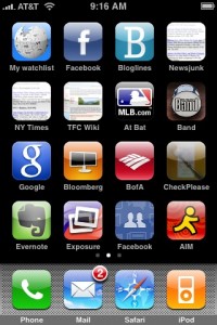
First: there’s gotta be a better way to manage application icons than just spreading them over three or four screens as they get installed. Yes, obviously I can manually spread them out over screens, but I found myself yearning for … folders. Or something. I think some of the jailbreaker guys may have come up with some concepts that would be worth copying buying here.
Second: man, it’s great, but also weird, to have mail coming in in the background without my manually fetching it. And it’s great, and not weird at all, to be able to delete multiple mail messages at once. That’s the killer feature for me right there. No more slide–click Delete–slide–click Delete–repeated ad infinitum.
I’m really, really glad that Apple made the Contacts feature an application instead of burying it in the phone menu. That was one thing that always made me wonder: why did the designers think that the only time I would need access to my contacts was when I was making a phone call?
I was hoping to give the VPN and Exchange integration features a crack, but I need to get some settings from our IT guy and he’s not in; that will have to be a later post.
The on-phone App Store is very nice. I frankly found browsing the store through iTunes to be something of a pain, and the experience on the phone is much nicer. I don’t know why–perhaps it’s the fact that the browse views in the store don’t show the app icons?
The scientific calculator is a nice blast from the past. One minor quibble–I hadn’t realized until playing with it that the calculator uses a font with proportional width numbers. It’s not noticeable unless you’re rapidly changing the numbers in the display–say, by repeatedly hitting the Rand or sin buttons–but seeing the leading zero jiggling around in response to the keypresses is a little disconcerting.
Mobile Safari hasn’t crashed on me yet. It used to reliably crash on loading certain long or complex pages. So that’s something.
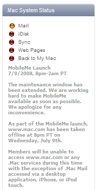
Oh, and those nice screenshots? Built in feature. Hold the main button and tap the power button, and a screenshot is saved to your Pictures, where you can email it or upload it (if MobileMe is working).
So that’s the base OS: nice, and featureful. But of course the excitement of the new firmware is the App Store, so we’ll talk about that next.

