-
Whaddaya know, something approaching a substantive, respectful discussion of the issue.
Day: December 11, 2008
Failed iPhone restart? Restart it again
My iPhone hung this morning while I was trying to delete a message in my Gmail account. I sighed and did a restart (hold the top sleep switch and the home button down at the same time). And it came up… with a screen that told me (in graphics) to plug the iPhone into iTunes.
I was concerned I had bricked the phone, but it seemed to still be functioning: I could make emergency calls, and I even got a notice that I had received a text message.
I normally sync the iPhone at home, so I figured I’d be without it all day long. Then I checked my Twitter replies, and my old friend Andrew Bartelt suggested that I simply try rebooting/resetting the phone again. Forehead now sore from whacking myself upside the head, I now again have a working iPhone.
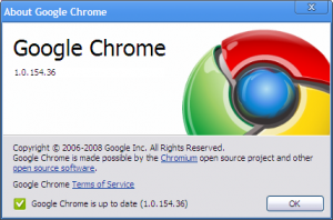
Google Chrome 1.0 (.154.36)
Well, that was fast. Google Chrome went from new to 1.0 in about 100 days:

But is it ready? And why so soon?

I expected Google to add more features over time, since the merely architectural improvements of the browser didn’t seem to meet the critical differentiator threshold to justify launching a new browser. But that didn’t really happen. And in fact, Google seems to be launching Chrome with some rough edges intact. Check out this snippet of the WordPress 2.7 login screen (right).See those black edges around the box? That’s a rendering bug in Chrome’s version of WebKit. (The black corners aren’t there in Safari.)
So: Google is rushing a new browser that they “accidentally” leaked just 100 days ago, a browser that has significant speed but demonstrable rendering flaws, into an already crowded market. Why? And why launch two days after previewing the Google Native Code plug-in, a web technology that seems a far more significant leap forward?
My guess: they’re scared of having their thunder stolen, maybe by Firefox. The new Mozilla JavaScript engine, TraceMonkey, appears to be running neck-and-neck with Google’s V8. And when the major feature in your browser is speed, you don’t want to risk being merely as good as your better established competitor. So maybe releasing Chrome ahead of Firefox 3.1 (which still has no release date, and at least one more beta to go) was simply a defensive move to make sure they aren’t competitively dead before they launch.
WordPress 2.7 First Impressions
I just did the upgrade to WordPress 2.7 on my server and am getting to know it. My first impressions:
- The upgrade was smoother this time, perhaps because I knew what I was doing. I didn’t even have to clear cookies to make it work.
- The admin interface, which is the major focus of this release, UI wise, is going to take some getting used to. It’s busier than the old interface, which is rarely good. And I’ve already published my criticism of the left hand navigation. The good news is that for the most part it’s getting out of my way and letting me write.
- The posting interface is more cluttered too. I never had to bother about the autosave notices before, because they stayed out of the way and were discreet in white text against a dark background. The autosave notices now are very visible when they happen, and pretty distracting. And after the last interface the new screens seem a little washed out (I’m using the blue color scheme).
- It took me a few seconds to figure out that the “Edit” link in the Posts module would take me to a list of all my posts–that used to be the Manage Posts link. I understand the reason for the change, but Edit isn’t the first thing I think about when I’m searching through my old posts, my most frequent reason for visiting that part of the admin interface.
The only plugin issue I had was with Simple Tags. On the reboot a notice advised me that I should use “Simple Tagging” by the same author instead. This doesn’t appear to have been correct; all I needed to do was upgrade Simple Tags.
