Outlook 2007 annoyances: keyboard shortcuts

Things you can’t do with Outlook 2007: assign custom keyboard shortcuts to Ribbon items.

This is annoying if you have certain keyboard shortcuts hardwired. For instance, in Outlook 2003 (and Word) one could access the “Paste Special” command (which gives a number of optional formats in which content can be pasted into a document, including unstyled text) with the keyboard shortcut alt+E, then S. Alt+E is an old Windows keyboard shortcut that allows accessing menus using their accelerator key, and for several Outlook releases, “Paste Special” has had S as its accelerator command.

Fast forward to Outlook 2007. The editing window uses the Ribbon, rather than menus, and so alt+E doesn’t do anything. However, alt+S does. So if you happen to hold down the alt key and type E S, thinking you’re going to paste something in the message, Outlook will merrily send it, minus whatever you were going to paste, instead.

Is there a solution? The only way around the issue that I’ve found requires writing a macro to invoke the functionality, assigning the macro to a custom toolbar button, and then mapping that button to a keyboard shortcut (say, alt+E). Convenient? No. Quick? No. In fact, there doesn’t seem to be a way to make it work consistently in Outlook at all.

Sigh. Hope we can get this fixed at some point.

links for 2008-07-23

WordPress for iPhone

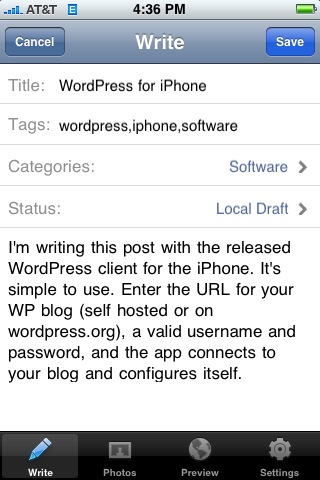
I’m writing this post with the released WordPress client for the iPhone. It’s simple to use. Enter the URL for your WP blog (self hosted or on wordpress.org), a valid username and password, and the app connects to your blog and configures itself.

As you can see below, not only does the client support categories and tags, but photos as well. You can either incorporate an existing photo from your library or take a photo from within the app.

Concerns:

  • the text editor doesn’t provide any shortcuts for markup, so even creating a simple list is pretty arduous
  • the app only prompts for a password once–convenient, but a security risk. If you lose your iPhone, your blog is compromised.

Overall, though, a killer 1.0 and a good way to really mobilize blogging. I look forward to giving the app a proper shakedown next week at Tanglewood.

Update: Okay, there are a few other bugs to shake out:

  • The UI for actually posting a post is a little non-intuitive. Rather than a big Publish button, you have to change the status of the post to Published, then save the post. This is probably so that you don’t hit the button with your thumb by mistake, but it’s still a little annoying.
  • The publish process seems buggy. My post at first failed to publish–the app crashed–then published, without sending its image. To attach the screen capture, I resorted to emailing the photo to Flickr, then adding the URL to the post. Not trivial, and without copy and paste impossible to tie the photo back to the post without going to the computer.

The photo thing is annoying. The crashes on posting are a big big problem.

links for 2008-07-22

Why some website redesigns work

Generally, it’s because they aren’t just slapping a new coat of paint (er, HTML+CSS) on the same pig. In the most successful cases, they’re a complete rethink of what the site is trying to communicate and a complete new set of ways to make that happen.

That appears to be the case with the redesign of the MIT Sloan website. It’s a sign of how bad the previous site was that I missed the redesign happening back in March of this year. But the b-school that I came from has come a long way since I was the sole MBA blogger back in 2001-2002. There are podcasts, official and unofficial blogs, and news feeds galore, all of which combine to give a much richer picture of everything that happens at the school. Compared to the 2004 site redesign, which put a thin veneer of Annoying Flash Movie on top of largely the same static content, it’s revolutionary.

It all conveys what I think is the unique strength of Sloan: it’s a school that’s focused, despite its size and institutional veneer, on empowering individuals and encouraging entrepreneurial endeavors. And to that end, it’s great to see the aggregated feed of Sloan student blogs right alongside official podcasts and other school-developed content, all together in the Sloan master feed. Of course, it would be nice to see everyone posting more often, but nobody’s perfect.

Friday: too busy working …

… to write anything halfway intelligent, so you get this instead.

But Estaminet has been writing a fair bit; check out her travel journals from her Oregon trip.

She’s back staying with us, and our parents come in late tonight, so it’ll be a fun full house. This is, of course, the other reason I’m not writing so much–lots of stuff to take care of before I pick them up from the airport.

And I’ll be checking out the temporary James Hook lobster shack this weekend to see if they’ve been able to resume any level of retail operations. It would be great to get some in time for my dad’s birthday.

links for 2008-07-18

Basement library complete


Here’s the after to Tuesday’s before, with my row of Bestå shelves from Ikea fully assembled. The doors went on Monday night, and the books went in the last few nights. I’m still waiting on one glass door and a few DVD organizers for the small shelf to the right, which will help with the clutter there.

The hardest thing about the shelves is probably just deciding where to put them to maximize storage. The shelves that meet the bottom of the glass doors need to stay fixed, and there are LPs behind the bottom doors, so that dictates the position of two shelves; and there needs to be another fixed shelf about a third of the way down for stability. But there are a lot of options for the other shelves. I ended up doing something I swore off years ago: sorting books by size and spacing the shelves accordingly. I bought five extra shelves for the units I bought (comprising four 75-inch bays and one 50 inch bay), and I think I still need to buy one or two more extras.

Bonus: click through on the photo and look at the “original size” version on Flickr, and you can get a pretty good look at the titles in my library.

links for 2008-07-17

Apple: MobileMe isn’t really using “push” with your PC

MobileMe (aka former .Mac) subscribers received an overdue email from the MobileMe team today, apologizing for the rocky roll-out of the new service and extending a free month of service to all subscribers.

The email contained the following interesting paragraph:

Another snag we have run into is our use of the word “push” in describing everything under the MobileMe umbrella. While all email, contact or calendar changes on the iPhone and the web apps are immediately synced to and from the MobileMe “cloud,” changes made on a PC or Mac take up to 15 minutes to sync with the cloud and your other devices. So even though things are indeed instantly pushed to and from your iPhone and the web apps today, we are going to stop using the word “push” until it is near-instant on PCs and Macs, too.

What a welcome breath of fresh air: unambiguous retraction of unjustified marketing hype!

As a product manager, it strikes me that the team managing the rollout did an excellent job of damage control: fix the operational problems, apologize to the customers, change the marketing message where it’s out of line with the new reality, extend credit and move on. And they’ve done a good job. I even have to retract my characterization of MobileMe as the Lindsey Lohan of webmail services (last paragraph).

links for 2008-07-16

iPhone SalesForce app: free, but access = $

A quickie I left out of my original iPhone app roundup: I wasn’t able to get the mobile SalesForce client working. The reason is, in retrospect, unsurprising: our company doesn’t have an “unlimited” SalesForce license, and customers on cheaper plans will be nickeled and dimed to use the app.

It’s good to see that some nasty business models are going to survive on the iPhone platform. So is my response: the SalesForce app is deleted.

Basement update: bookcases are in

A quick update on our basement project: it looks like we’ll make our deadline. The picture to the right shows a stage in the completion of the project, with the Bestå bookcases mostly assembled and the Flor carpet in.

I was able to finish the carpet with about an hours’ worth of work on Sunday. I was pleased with how well it came together and how solid it seems now that it’s settled in for 48 hours. Oh yes–and it’s bright too! Hoo boy. But it works in the otherwise slightly dark basement room, and helps set it aside as a “family” room as opposed to our more formal spaces.

The bookshelves were pretty straightforward too, though assembling three sets of shelves takes a little time. They’re cam-locked standard Ikea frames, just like a Pax closet or Akurum kitchen cabinet, or just about any other flat pack furniture, so the timely part is in leveling them so that the doors will line up properly, and in securing them to the wall. I was luck and hit studs going into four out of the six locations that were recommended as anti-topple points, so between that and the fact that the frames were screwed together I think we’re in business.

Since the picture was taken, I’ve finished hanging the glass doors on the front of the cabinets and have begun loading in the contents, which will take a while. I’ll post one more update when the shelves are all loaded in.