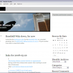
 I switched on Monday to a new theme, Excel, that addresses a few of the issues I had with Cutline. The color balance is much better than with the version of Cutline I was using (which I must say, in all fairness, was a much older version of the theme). I also like the layout, which is a two column layout but which floats the post “trivia” (publish date, tags, categories, etc.) in a separate mini column, leaving just post title and text in the main column.
Things I don’t like:
- The amount of vertical space consumed by the header region (seems to be a common trend among the themes I’ve tried so far)
- Need to tweak styles — tags and recent comments run into each other, headings in the sidebar are too prominent, need some custom style work for the Delicious widget
- The dark borders around images and the big blocky links make the top of the page feel too heavy
But it feels closer than Cutline did.

One thought on “Today’s theme: Excel”