Why go to Mars? Let’s make the Northeast habitable first

Alarming, this finding from Cornell that the landing site of the Spirit, in the Gusev crater on Mars, was warmer yesterday afternoon than 14 major points in the Northeast. For the record, the landing site was 12° F, while the warmest city noted, Providence, RI, was only 9° F, while of course Mount Washington, NH, weighed in at -36° F.

Which is before wind chill.

Kind of puts Bruce Sterling’s comments about needing to settle the Gobi Desert before we go to Mars in the proper perspective. Maybe what we should really do is wait for global warming to make the Northeast habitable first.

On helping customers, or the questions we get

Joe Bork posted a hilarious list of real and made up questions that people ask him when they learn he works for Microsoft. My favorites:

  • How to use Word’s Mail Merge feature
  • How to use Excel’s PivotTable feature
  • How to use PowerPoint’s Slide Transition feature
  • How to use Outlook’s Journal feature
  • What that one error message means, come on, I know, the one with the buttons and the exclamation point thingy
  • Do I read Slashdot too, and how does it feel to be an assimilated corporate drone carrying out the evil, subversive plans of a massive, soulless company that is racing towards its own inevitable doom because of the undeniable goodness and purity of the free (as in speech, not as in beer) software movement
  • How much free (as in beer, not as in speech) pop I drink
  • Have I heard this one great Microsoft joke yet, it is really very clever, okay stop them if I’ve heard it

I think it’s pretty obvious why I like the last four items. The first four items? It reminds me (as if talking to people over the holidays weren’t enough to remind me) that each of us is an ambassador of the company, which for many people means that we are their one chance at a personal connection with software they try to use to get things done.

Which is why I don’t mind answering questions about Office features, if I know the answer, or helping people find their answers in Office Online or the Knowledge Base if I don’t. Generally I end up learning something too.

More semantically correct page layout

I really should hang out one of those old “under construction” signs on this site. I keep finding new ways to tweak and optimize both the HTML and the CSS on the site. The under construction part? It may look funny unless you refresh your browser to force the style sheet to reload.

Today’s tweaks:

  • I cleaned up the style sheet, fixing some font inconsistencies (and incidentally saving almost a full kilobyte of file size). I did this by grouping all the CSS classes and other selectors that should have a sans serif font together and stating the font family name once and only once. (For the curious, the exact code is a comma-delimited list of class selectors, followed by this property listing:
    { font-family: font-family: "Lucida Grande", "Lucida Sans Unicode", verdana, lucida, sans-serif; }
  • At the same time, I added a new selector that sets the size of H2 headers in my sidebar to 11px, and changed the markup in the sidebar so that each of the bolded headings are tagged as <h2> rather than <p><b>.

So who cares? My readers who use Lynx or other user agents (for instance, the wireless version of Google, which scrapes pages into WML). Now, the sidebar is defined as a series of headings with detail underneath, rather than as an unstructured bunch of paragraphs.

Next step of course is to make it so the content, not the sidebar, appears first in those other browsers, and loads first in modern browsers. That’s a harder job than it appears; more details to come.

RSS on the desktop

Some developments in some software I’m pre-alpha-testing make me wonder: where are the scripts to translate data on your desktop to RSS? On a Windows machine, I would want the security log as an RSS feed for sure. On an OS X machine, some of the system event logs. On both, my mail client.

I’d start hacking my own, but I haven’t seen good base classes in AppleScript to produce RSS. Maybe it’s time to learn Python…

The long hand of history

When I was writing last night’s item about Easter eggs, I linked to my old project, Procurement Desktop – Defense, without following the link. This morning, I clicked the link and was pleased to see that the last release that I worked on, as a developer, system architect, and requirements lead, has finally gone out the door as Version 4.2. Going down the list of system features, I recognize many that I designed, coded, and fought for. It’s amazing that they were released in 2003 when the code was complete and entering testing in late 2000, but that’s life with the government.

Speaking of Easter eggs…

jeff powers

Thanks to George for this tip:

On the random side of things… Jeff Bezos turns 40 today. Curious? Search Amazon.com for old fart. (Only works on 1/12/04)… [The Chang Journal]

Since the item is going to disappear after midnight, I’ve taken the liberty of reposting the image and text:

Happy 40th Birthday, Jeff Bezos
January 12, 1964

Much better than most of the Easter eggs I’ve ever put in software. Most, but not all…

There was a hidden Easter egg in an old version of the procurement software I worked on that invoked a picture of our development manager, Mike Stopper, head back, snoring, exhausted after an all night coding binge in Saudi Arabia. (Which is another story.) What can I say? It was before we won our contract. The Easter egg was subsequently, unceremoniously, stripped out. But it was probably the best one I ever did, with the exception of the one that I nixed partway through, which would have translated every error message in the system to Pig Latin. Er, Ig-pay Atin-lay.

What happens to abandoned nations?

When both BoingBoing and Slashdot have breathless writing about the future of a small Pacific island nation, you know something’s up. In this case, the island is Niue. You know, as in .nu, the top level domain of the hip. Well, at least of one hip person, Moxie.

The island leaders, in the aftermath of a cyclone that caused more than $50 million (NZ) in damage, are calling for the island nation to return to New Zealand governance and predicting that the island will eventually be deserted. While this might not seem such a big deal—after all, as the original snarky article in the New Zealand Star Times points out, Niue only has the population of a large secondary school—the island was a favorite of geeks for creating the first national wi-fi grid and for selling their TLD to all comers.

The question is, what happens to all those .nu sites?

Dave: Happy users or arcane buggy formats?

Dave’s morning coffee notes take a slightly grumpy tone this morning, as he sets up a strawman in the prickly area of data format support, and knocks it down:

I’ve heard it said that “He who is most liberal in the formats he accepts wins.” I say a couple of things in response. 1. He who says shit like that is probably getting consulting money from a BigCo. And 2. He who has the most happy users wins (and goes to heaven). Users love features, and developers who spend time supporting the most arcane buggy formats aren’t spending time on features that delight users. Formats are there to get the job done, not be pure, not be wonderful, just work, and shut up.

My counter-argument: Look at GraphicConverter. (You could make the same argument with most graphics apps, but let me run with this for a second.) The app started off, as its name indicates, as a tool to convert between graphics formats. And it supports every graphics format: old Amiga formats, JPEG 2000, microscope formats, Windows MetaFile, even graphics from Acorn computers. When it came on the market 14 years ago (!), it did one thing well: conversion of graphics files from one format to another. It’s subsequently built on that base and added neato features like magic wand selection, color correction, alpha channels, until it basically provided all the functions that Photoshop 1.0 or 2.0 had at a tiny fraction of the price. Today it’s my only graphics editor, and it’s immensely valuable. But it’s hard to argue it would have gotten where it is today without being very liberal in the formats it supports.

So what happens to a Web browser that only supports XHTML? Or a newsreader that only supports Atom?

Dave’s post is right: it’s about the users and their needs. But sometimes the users need software that is format agnostic to get the job done.

Hello to my 10 subscribers

Dave has been steadily rolling out new features in his OPML aggregation site, feeds.scripting.com, including:

If you’re not already participating in this community, and you use an aggregator, go, go, join. It’s getting cooler every day.

The past, in living color

russian children on hill 1909
Lisa and I watched a special on the Library of Congress last night on PBS and were blown away by one of the exhibits, a selection of color photos from Tsarist Russia.

Yeah, you read that right. I was blown away, so made my way back over to the LOC website for more info, and found the exhibit, called “The Empire That Was Russia: The Prokudin-Gorskii Photographic Record Recreated.” The Tsar’s photographer, Sergei Mikhailovich Prokudin-Gorskii, invented a camera that took three black and white plates through red, green, and blue filters of the same scene; he would then project the images through colored filters for color images in a magic lantern show. The LOC has taken the plates and recreated the process digitally, applying additional corrections such as careful re-registration and color correction, to yield glorious full color recreations of Prokudin-Gorskii’s photos, which document the extent of Tsar Nicholas’s empire on the eve of revolution.
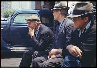
new york bowery bums 1941

In looking to see who else had written about this exhibition (which is, after all, not news), I found another treasure trove of early color photos, the Charles W. Cushman Photograph Collection at Indiana University. Cushman, a gifted and dedicated amateur photographer who embraced Kodachrome film as early as 1938, two years after its introduction, left an archive of more than 14,000 color slides taken between 1938 and 1969 across the US and other countries. The image quality is outstanding, the indexing superb, and the sense of dislocation even more intense than with Prokudin-Gorskii’s photos. As the introduction to the collection points out, most of us don’t have a “true color” sense of the time before about 1950. Seeing color images of Faneuil Hall before the elevated highway was raised, for instance, is mind-boggling. But Cushman looks beyond buildings, capturing, for instance, a wedding in Boston’s North End, carriage horses feeding in the Piazza Ognis in Florence, the old fruit and vegetable market at Covent Garden in London, children on an old dirt road with flowers in Fairfax County near Dranesville (what is now the northern part of McLean), the Grand Coulee Dam under construction, and many others.

Jarrett House North, now automatically Print Friendly

I have, I think, put the finishing touches on another element of the new design for this website: the print stylesheet. One of the things I wanted to do when I first transitioned this site to a CSS based design was to optimize the print experience as well as the online experience. CSS, through using stylesheets linked for media="print", allows you to specify alternate presentations of your pages for print purposes without having to change your underlying HTML or forcing the user to choose a “print friendly” view.

The print stylesheet for Jarrett House North now suppresses all the navigation elements, gives a reduced size version of the site logo, and (on browsers that support it, such as Gecko-based browsers and Safari) prints the full hyperlink as text next to each link. Give it a whirl—I think you’ll like it.

For now, the regular print-friendly link will remain on every page, for print-friendliness on browsers that don’t offer full CSS compliance. But you no longer have to do anything special to get that print friendly feeling.

One interesting implementation thing I learned in the process. I couldn’t figure out how to dynamically resize the banner image and provide alternate text that I didn’t show in the main template, so I created a DIV that is hidden by the default stylesheet (by setting display: none;) and shown in the print stylesheet. Or at least, that was the intention; the first few times I made the change, the print version of the banner never showed up. I finally figured out that the default stylesheet’s rules are applied to the print content, then overridden by the print stylesheet’s rules. So rather than just redefining the div, I had to actually specifically override the display property by setting display: inline;. Once I did that, I was golden.

The main resource I used in creating the print stylesheet was an article by Eric Meyer at A List Apart called CSS Design: Going to Print.

Snow-stalgia

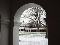
snow at uva from pav vii arcade
I was overwhelmed with a bit of nostalgia for my undergrad days today and decided to go hunting for pictures. I found David Evans’ site and was blown away. Evans, who is on the Computer Science faculty at the University (and an MIT grad), has hundreds of photos on his site, including many astonishing (and astonishingly big) ones of the University grounds. One of Evans’s photos of the Rotunda in snow is currently adorning my desktop; credit where due.